| Author | Thread |
|
|
09/28/2007 01:17:02 AM · #1 |
I did this photo for the Deja Vu III challenge but have been having problems with my computer, so I couldn't turn it in. It's constantly shutting down on me. Anyway I really enjoyed this challenge and still would like to know what others think. The original was done by Larus titled Ready to Pop for the Pop Culture challenge.
Here is that image:

and here is mine:
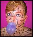
I know I'm not quite up to his level but I am learning and I am trying really hard and would like all the helpful advice I can get. :) |
|
|
|
09/28/2007 01:20:43 AM · #2 |
It looks good but really watch your edges...a bit of rough selecting there.
|
|
|
|
09/28/2007 01:26:31 AM · #3 |
| Her eyes just dont have the same POP that Larus's original does. She almost looks bored. And I agree with Judi also, the edges are pretty rough. |
|
|
|
09/28/2007 02:56:47 AM · #4 |
Missing Expression!
Model of Larus is looking straight into the camera while your's is looking upward which makes the difference. One can also see how the Larus composition is playing role, even by keeping the head centered it is attractive because of placing models shoulder beautifully but in your,s it's a flat. |
|
|
|
09/28/2007 03:26:01 AM · #5 |
Yep - first thing is the eyes - your models eyes are beautiful, but lack 'POP' try using this tutorial...
Pimp those eyes
Also Larus's model seemed engaged in the making of the image - your model looks bored.
Also if you notice Larus had the model focus her eyes more or less straight ahead, your model was looking up - sort of adding to a less than thrilled look.
Also that lower viewpoint Larus shot at made his models neck elongated and give lovely lines into the shoulders.
The higher viewpoint you shot from made you models neck seem like it was squished into her shoulders.
I'm thinking (if you use Photoshop) that if you made a 'Selective Colour layer' - selected Black and upped it a bit you'd get the words 'popping' more and a bit more zing - perhaps a bit more 'Brightness/Contrast' too.
Hope this helps.
Lisa |
|
|
|
09/28/2007 03:33:12 AM · #6 |
Another main difference seems to be the lighting, look how Larus model "glows" from the additional backlighting.
|
|
|
|
09/30/2007 02:37:49 AM · #7 |
Hey thanks for the comments everyone!!! I haven't been able to get back on line since posting this. As it is I'm on yet another five minute window of power. I wish we could find this model transformer. It appears its no longer being made so who knows when I'll get lucky again.
Again thanks for all of your comments!!! They were very helpful and I was thinking the same thing about the angle, especially once I got the two side by side. |
|
|
|
10/08/2007 06:19:23 AM · #8 |
 bnilesh pm´d me about this thread so I thought I´d comment on it :) bnilesh pm´d me about this thread so I thought I´d comment on it :)
Well actually think most of what I would critique has already been said, if you had corrected the angle it´s shot from and had some backlighting you´d be pretty much set. Your´s actually seems a bit noisy though but since you don´t include your camera settings it´s just a guess on my behalf, it´s hard to make stuff like noise and sharpness out at web size resolution. I would guess though that maybe you shot this with a high iso, or maybe had it a bit underexposed and brought it back in post processing?
Anyway, honored you wanted to "Deja Vu" one of mine, feel free to PM if you have any questions and I´ll do my best to answer in this thread :) |
|
Home -
Challenges -
Community -
League -
Photos -
Cameras -
Lenses -
Learn -
Help -
Terms of Use -
Privacy -
Top ^
DPChallenge, and website content and design, Copyright © 2001-2025 Challenging Technologies, LLC.
All digital photo copyrights belong to the photographers and may not be used without permission.
Current Server Time: 12/04/2025 03:41:42 PM EST.


