| Author | Thread |
|
|
09/08/2007 10:44:26 AM · #1 |
Hey everyone,
would appreciate any critiques on this shot that i entered in the last free study:
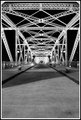
Not quite sure why it did so poorly, Thanks,
Ryand
|
|
|
|
09/08/2007 10:51:59 AM · #2 |
| Left a comment on the photo! |
|
|
|
09/08/2007 10:54:51 AM · #3 |
Didn't vote this one... Sorry but I couldn't have given it much more that a 5. IMO, the interest level is just not happening. It seems to turn to mush dead (bright and not so clear) center in the shot. I personally am not a fan of leading lines that lead to the center of the frame...too calculated for me. As presented, I would have have liked to see the ground level that is leading me in be the sharp point.
Just my 2 cents... |
|
|
|
09/08/2007 10:56:52 AM · #4 |
|
|
|
09/08/2007 11:09:07 AM · #5 |
| I gave this a 5 =S It's not bad, it's just that free study challenges have very high standards, if this were in an average challenge it would probably be in the higher 5s. |
|
|
|
09/08/2007 11:14:04 AM · #6 |
|
|
|
09/08/2007 11:24:22 AM · #7 |
| It's black and white. There's nobody on the bridge. The focus is a little bit soft. I'm actually encouraged that you scored as high as you did. |
|
|
|
09/08/2007 11:29:36 AM · #8 |
| I'm old fashioned and never score B&Ws very high. |
|
|
|
09/08/2007 11:30:06 AM · #9 |
Left a comment and some examples of other ways to frame it.
|
|
|
|
09/08/2007 12:03:12 PM · #10 |
Why do you think it should have scored higher?
I'm not trying to be mean. I think if you answer that question honestly (to yourself, not us), then you may have a better understanding of why it didn't score higher.
You might also try comparing your photo to the ones that did score higher. Try to determine what it is about those photos that would make people like them more than yours. IOW, "What do they have that I ain't got." Once you figure that out, then all you have to do is make sure that you get those features into your photos and you'll be scoring like a champ.
|
|
|
|
09/08/2007 12:28:35 PM · #11 |
|
|
|
09/08/2007 12:33:12 PM · #12 |
Empty foreground adds nothing to composition, it's just dead space. Half the image is dead space. The border is way too coarse for the delicacy of the structural elements. Those two aspects alone drop it to the low mid-range IMO. Add to that the fact that this is entered in a Free Study, which typically has a TON of really outstanding images, and the score is no surprise at all.
R.
|
|
|
|
09/08/2007 12:34:26 PM · #13 |
Originally posted by Scholten:
I'm old fashioned and never score B&Ws very high. |
Isn't black and white old fashioned? |
|
|
|
09/08/2007 12:35:54 PM · #14 |
Its got some good contrast, its a bit grainy and the light is artificial looking- but really it fails most in composition- its too balanced; never have two intervals the same- place the bridge line at 1/3 or 1/4 of the way up; the shadow line doesn't help either.
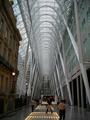
heres one of mine that isn't so good, but it has better placement of the big architectural white thing-
Paul
Message edited by author 2007-09-08 12:37:22. |
|
|
|
09/08/2007 12:45:50 PM · #15 |
Originally posted by Bear_Music:
Empty foreground adds nothing to composition, it's just dead space. Half the image is dead space. The border is way too coarse for the delicacy of the structural elements. Those two aspects alone drop it to the low mid-range IMO. Add to that the fact that this is entered in a Free Study, which typically has a TON of really outstanding images, and the score is no surprise at all.
R. |
Totally agree with everything Robert said.
|
|
|
|
09/08/2007 01:52:14 PM · #16 |
thanks all to the comments, and critique, i can see what everyone is saying, appreciate it
Ryand
|
|
Home -
Challenges -
Community -
League -
Photos -
Cameras -
Lenses -
Learn -
Help -
Terms of Use -
Privacy -
Top ^
DPChallenge, and website content and design, Copyright © 2001-2025 Challenging Technologies, LLC.
All digital photo copyrights belong to the photographers and may not be used without permission.
Current Server Time: 09/11/2025 04:33:41 AM EDT.


