| Image |
Comment |
| 11/16/2004 02:21:38 AM |
|
 Photographer found comment helpful. Photographer found comment helpful. |
| 11/15/2004 12:51:45 PM |
|
| Photographer found comment helpful. |
| 11/15/2004 12:49:10 PM |
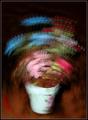
September by moodvilleComment: Nice work. I like the composition and colors but the processing makes it look like you almost cut and pasted two different images together?
The outer edge of the rocks at the bottom of the image seem unreal.
I rated it 7 overall. Message edited by author 2005-10-06 10:31:02. |
| 11/15/2004 12:31:19 PM |
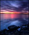
The Artistby scalvertComment: Edit: WOW! you fooled me :) that is what I get for trying to do so much voting and not spending enough time reviewing each photo. Message edited by author 2004-11-22 00:03:39. |
| Photographer found comment helpful. |
| 11/15/2004 12:25:28 PM |
Colorsby crabappl3Comment: Nice work. But I feel it has to much white space. |
| Photographer found comment helpful. |
| 11/08/2004 03:25:54 PM |
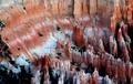
Bryce Canyon, Utahby RHoldenSrComment: I would just like to say thanks for all the great votes and comments.
This shot was taken at "Dawn" at the Bryce Canyon lookout, just before the sun broke over the horizon. The winds were "very" strong that morning and it was one of the few shots I took that morning that I was happy with.
With all the shots I took on our vacation to the Canyons/Desert I had a very hard time trying to decide which one I was going to enter in the October Free Study.
Thanks again. Message edited by author 2004-11-08 15:28:08. |
| 11/01/2004 11:50:22 PM |
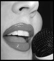
Karaoke Nightby hlswilsonComment: Not a big fan of this shot in black & white. But that does not affect my vote, the quality is still very nice. |
| Photographer found comment helpful. |
| 10/25/2004 08:53:07 AM |
Implied Linesby stupidcatComment: Nice work. I feel it could use a little more contrast and sharpening. Also I feel the composition could have been better. |
| Photographer found comment helpful. |
| 10/25/2004 12:46:01 AM |
Tranquilityby TLL061Comment: Nice idea and very good work.
It appears to me to be lacking in contrast somewhat. It looks a little overexposed. |
| Photographer found comment helpful. |
| 10/25/2004 12:44:18 AM |
Post Timeby GeneralEComment: Very good idea anbd nice work. I feel it could have used some Level or curve adjustments. It seems to have a little to much contrast (Slighltly Washed out). |
| Photographer found comment helpful. |
Home -
Challenges -
Community -
League -
Photos -
Cameras -
Lenses -
Learn -
Help -
Terms of Use -
Privacy -
Top ^
DPChallenge, and website content and design, Copyright © 2001-2025 Challenging Technologies, LLC.
All digital photo copyrights belong to the photographers and may not be used without permission.
Current Server Time: 12/14/2025 01:08:09 PM EST.