| Image |
Comment |
| 04/12/2006 12:22:46 AM |
|
| 04/11/2006 11:49:04 PM |
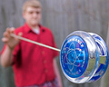
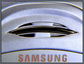
Some like them, some don't!by BMacDComment: From the Critique Club:
This is a very difficult shot for me to critique because I am not a great fan of the abstract type of shot. I just don't understand that form of the art. I can tell when something works and can appreciate that some like it, but in general don't go for that kinda shot.
What seems to work here. I like your lines and overall composition.
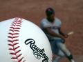
What doesn't seem to work. First of all you have the word Samsung prominently displayed in the shot. The challenge description plainly said if you can identify it it doesn't meet the challenge. You have a lot of what seems to be noise here. However, without seeing the subject of the shot I can not say that is what it is. Lastly and most importantly, there is now 'wow' factor. There is nothing to hold my attention.
There have been many challenges that deal with macros or abstracts. I suggest going through them and looking at the top 15 or 20 and the bottom. This will give you an idea of what works and what doesn't.
Sorry I couldn't be more helpful...
TC |
 Photographer found comment helpful. Photographer found comment helpful. |
| 04/11/2006 12:08:03 AM |
|
| Photographer found comment helpful. |
| 04/11/2006 12:07:07 AM |
Blowing In The Windby ShermyComment: This shot is the bomb! And you're kinda hot too...
TC
Edit: Just noticed you're only 17. So change 'kinda hot' to 'a very beautiful young lady'! ;-) Message edited by author 2006-04-11 00:09:34. |
| Photographer found comment helpful. |
| 04/06/2006 04:47:02 PM |
|
| 04/03/2006 11:18:40 PM |
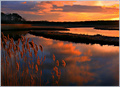
Flood Tide & Cattails — Sunset by Bear_MusicComment: Holy crap Batman, Robert finally won his second ribbon and it's a blue even! Where the hell have I been for the last week to have missed this awesome shot! What can I say. The lines are incredible! The sunset is beautiful but isn't the subject of the shot. The reflections, the foreground focus... Kudos!
Yours as always
TC Message edited by author 2006-04-03 23:21:59. |
| Photographer found comment helpful. |
| 03/30/2006 01:40:29 AM |
Eleganceby peeceeComment: Been so busy that this is the first that I saw this. Kudos on the blue! Well deserved. Awesomely simple shot.
Yours
TC |
| Photographer found comment helpful. |
| 03/25/2006 12:33:07 PM |
Peanut Butter and jell O ?!?by mfairbanksComment: From the Critique Club:
This is IMHO a perfect example of a technically well done shot that didn't score very well in the challenge. You have good DOF and focus. Your lighting is very nice. You have a nice white background but a little bit of grey around the base of the peanut butter cup. Your exposure is a touch off. The frosting on the peanut butter is a little blown out losing some of the detail. Well thought out and executed.
Why didn't it do so well? I think it is because the overall impact of the shot is a touch unappealing. I don't understand the reason for putting the jello inside or on top of the jar. Green 'peanut butter' makes me go eeewwww. So though this shot is well executed, it's not the kind of shot that scores well in this medium called DPC.
Yours
TC |
| Photographer found comment helpful. |
| 03/23/2006 10:41:16 PM |
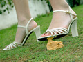
Fashion Victim.jpgby AuroraChrismaComment: Definately a fun shot. My only complaint is this. I really like how the models face is slightly oof, but the front half of her front shoe is oof also. Just a tad more DOF and this would be PERFECTION!
Welcome to the community!
TC |
| Photographer found comment helpful. |
| 03/23/2006 12:23:40 AM |
Oh crap! I stepped in a pile of peanut poo!by SpitfyrComment: From the Critique Club:
This is kind of a hard image for me to critique because of the challenge restrictions. You had a very defined set if criteria for your shot. I think you met the challenge well.
What I like: I love the angle that you chose for this shot. Both the camera angle and the tilted perspective. I'm not usually a fan of tilted cropping, but I think it worked quite well here! Great DOF. What needs to be in focus is. What needs to be seen but not necesarily in focus is just that. Great colors except for...
What I don't like: I'm a little put off by the fact that your whites ain't quite white and you don't really have any black in the shot. Some work with levels would probably help with this. I'm also a tad bit (though I see the humor) put off by the subject. Not a lot of people in general like 'poop' shots for lack of a better term. This one was done tastefully but that is still what it is.
Why it didn't do so well in voting? I think it is probably the subject matter. See What I don't like above.
Keep on smiling and shooting!
Yours
TC |
| Photographer found comment helpful. |
Home -
Challenges -
Community -
League -
Photos -
Cameras -
Lenses -
Learn -
Help -
Terms of Use -
Privacy -
Top ^
DPChallenge, and website content and design, Copyright © 2001-2025 Challenging Technologies, LLC.
All digital photo copyrights belong to the photographers and may not be used without permission.
Current Server Time: 08/26/2025 05:01:51 PM EDT.