| Image |
Comment |
| 05/31/2006 05:21:38 PM |
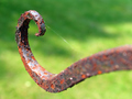
Octopus Gardenby eljay128Comment: Nice tones in the metal and nice contrasts with the green background. The cob webs are a little distracting though as is the shadow line in the background.
TC |
 Photographer found comment helpful. Photographer found comment helpful. |
| 05/31/2006 05:20:21 PM |
|
| 05/31/2006 05:19:24 PM |
|
| Photographer found comment helpful. |
| 05/31/2006 05:18:11 PM |
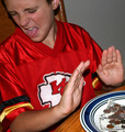
I Don't Care Too Much For Moneyby NoellaSueComment: Neat idea for the shot but a couple of things are distracting. First the models shirt design. A simpler shirt would have looked better. Your use of flash makes the lighting very harsh and flat and causes the hard shadows. Lastly, the money seems to be a little soft and it's supposed to be a main part of the subject according to your title...
TC |
| Photographer found comment helpful. |
| 05/31/2006 05:16:31 PM |
|
| Photographer found comment helpful. |
| 05/31/2006 05:15:38 PM |
You Won't See Meby scalvertComment: This is kinda cool in a Where's Waldo kinda way but oncce you found him it's doesn't hold much interest...
TC |
| Photographer found comment helpful. |
| 05/29/2006 07:03:19 PM |
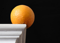
orangeby silviulComment: From the Critique Club:
This is a very elegant, very simple shot. I love everything about it. I love the sharp contrasts between the shelf and the dark background. I love how the orange acts as an intermediary between the white and black. It also grabs your eye and holds it. I love how the lines of the shelf lead your eye right to the orange even if it isn't needed. Incredible use of lighting though the hot spot on the orange does detract a little.
Only little nitpicks that I have. The orange could have been placed so you didn't have the dark spot at the bottom of it showing. The crack in the paint on the left side is a tad bit distracting. And as I mentioned above the hot spot on the orange.
Incredible shot for a first entry!
Why didn't this score better? Only the voters know for sure...
TC |
| Photographer found comment helpful. |
| 05/29/2006 05:52:41 PM |
Lateral Displacementby Bear_MusicComment: I totally can't believe that this finished way down at the bottom of the top 100. This was my favorite of those I got to vote on by far and one of the highest scores I've ever given out...
TC |
| Photographer found comment helpful. |
| 05/29/2006 12:11:27 AM |
|
| Photographer found comment helpful. |
| 05/28/2006 11:43:40 PM |
This Is My Lifeby JudiComment: From the Critique Club:
This shot overall is very nice. I'm torn about the lighting though. At first I thought that it was kinda cool that it was such a dark shot, but the more I look at it the more I think it's too dark.
Technicals: Very nice focus. Very nice colors. Very nice DOF. Exposure seems to be off. The shot is just dark. If this is what you were aiming for you hit the mark. Does it work? That is another question. Were you trying to seperate the subject from the background through darkening of the background? If so you did it. However, it doesn't look right. It looks like it was post processed that way and if you can tell it was pp'ed a certain way, IMHO you failed. Kinda like if you can taste one ingrediant in chili...
I would love to be able to see the original of this.
Yours
TC |
| Photographer found comment helpful. |
Home -
Challenges -
Community -
League -
Photos -
Cameras -
Lenses -
Learn -
Help -
Terms of Use -
Privacy -
Top ^
DPChallenge, and website content and design, Copyright © 2001-2025 Challenging Technologies, LLC.
All digital photo copyrights belong to the photographers and may not be used without permission.
Current Server Time: 08/26/2025 08:23:56 AM EDT.