| Image |
Comment |
| 07/26/2006 11:12:35 PM |
|
 Photographer found comment helpful. Photographer found comment helpful. |
| 07/26/2006 11:11:19 PM |
Taylor Photo Shoot 3by PixlmakerComment: Looks just a tad oversharpened. You have a touch of haloing around her hair. Was it a bright day? She looks like she's squinting just a touch. Nice shot overall though!
TC |
| Photographer found comment helpful. |
| 07/25/2006 01:10:23 AM |
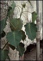
Nature Encroachingby UrfaKComment: From the Critique Club:
First of all I would like to say that I always like critiqueing/helping out the younger photographers here at DPC. I love it when someone with no training to hinder them can take shots that blow away those of us that think they know what they are doing.
This is actually a very nice shot! I love the contrasts that you have going here. Nature versus man, new versus old, color versus cold b/w, the angled plant versus the straight line of the pipe, I could go on and on... If this was a contrast challenge this probably would have scored much better! However, this was a challenge based on perspective where the unique perspective wins.
There is nothing technically that I can say badly about this shot. Everything is in great focus. Everything is exposed properly. The composition though not 'great' still follows enough of the 'rules' that it still has staying power. I can look at this shot 2 weeks from now and still appreciate it! The rules that you did break (eg: There is nothing truly white in what is mostly a black and white shot) really don't matter.
In short, I wish I had the perspective (no pun intended) of youth to see things without being limited by the 'rules'! Keep shooting. Don't get discouraged. If you ever have any questions, this is a great community of people to get help from!
Yours
TC |
| Photographer found comment helpful. |
| 07/25/2006 12:09:29 AM |
Point Vicente Lighthouse, Californiaby island_girl1Comment: From the Critique Club:
I really love lighthouses! This one looks very cool! I love the perspective that you chose for this one. In shots such as this often the perspective makes the building look wrong. You managed to make this look very natural. I really like the palm tree leaning into the shot. It adds to the drama of the shot. I also think the contrast of the dark doorway and the white of the lighthouse adds to the drama of the shot.
What could make this better? Well the first thing I see that detracts a little from the shot are the palms next to the door. A slightly different camera angle may have been possible to keep all the elements in the shot but removing those trees. I see a possible reshoot in your future! I am really dissapointed that you didn't have a dramatic sky day for this shoot. There are a few clouds in this sky but as is they are almost a distraction. Another reason to revisit!
Why didn't this score better? While this is a cool perspective, it's not all that unique. I think that was the point of the challenge.
I can't wait to see if you have more shots of this local.
Yours
TC |
| Photographer found comment helpful. |
| 07/24/2006 11:53:49 PM |
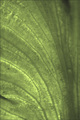
Green textureby Rino63Comment: From the Critique Club:
First of all let me preface by saying that abstracts are not my cup of tea. I can appreciate why some like the form, but I'm more of a traditionalist when it comes to the art of photography... That said:
You have some very nice lines here, but overall the shot is very flat. There is nothing there to keep ones attention for any length of time. As has been mentioned by other commentors, playing around in P/P would probably help this out. As an advanced editing challenge you could have done just about anything to the shot. I think the things that would MOST benefit this would be levels or curves (using more of the dynamic range of the shot effectively), boosting contrast (same thing) and boosting saturation (exagerate the tones somewhat). You could also use color balance and the like to actually change some of the tones to come up with something more colorful.
Like Tygerr said before, It's not bad or ugly, it's just not that stunning either.
Yours
TC
|
| Photographer found comment helpful. |
| 07/24/2006 01:50:25 AM |
Fairy Juiceby khdossComment: This shot is simply incredible! I can't take my eyes off of it. There is so much going on, but there's nothing there that is distracting! It all goes together in an almost primordal way. The lines all flow. Through the wings into her arms. Up her arms and through the flower. Through the flower and into the stem. Down and back into the distance where there is another purple flower. Is there another fairie there? Sipping on her own magical rainwater?
Kudos onna fantastic shot.
Yours,
TC
PS: I can see you shooting... |
| Photographer found comment helpful. |
| 07/24/2006 01:39:45 AM |
|
| Photographer found comment helpful. |
| 07/24/2006 01:39:16 AM |
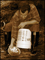
In Search Ofby OdysseyF22Comment: Details... In any set up shot, details are the key to the shot. You want to have only the details needed to make the shot work. Any thing else is a distraction. The writing on the bucket is a distraction. Everything else works to a tee!
Feelings... This rocks! I can smell the water and the dirt... Most of the 'feeling' in the shot I think is from the awesome tones that you've chosen. You made me feel like I was there except for the fact that I'm sitting on a modern bucket.
I can't wait to see who this is and what else you've done...
TC |
| Photographer found comment helpful. |
| 07/24/2006 01:31:15 AM |
|
| Photographer found comment helpful. |
| 07/24/2006 01:30:41 AM |
Evening Walkby ace flymanComment: Your horizon is a bit crooked... Straighten it and it would be a top 5 contender IMHO!
TC |
| Photographer found comment helpful. |
Home -
Challenges -
Community -
League -
Photos -
Cameras -
Lenses -
Learn -
Help -
Terms of Use -
Privacy -
Top ^
DPChallenge, and website content and design, Copyright © 2001-2025 Challenging Technologies, LLC.
All digital photo copyrights belong to the photographers and may not be used without permission.
Current Server Time: 08/25/2025 11:45:03 AM EDT.