| Image |
Comment |
| 11/12/2008 10:33:59 AM |
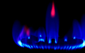
Le Feu Bleu by deemunComment: I think I would like this better if there was more negative space and if the whole flame were included in the shot. |
 Photographer found comment helpful. Photographer found comment helpful. |
| 11/12/2008 10:33:31 AM |
|
| Photographer found comment helpful. |
| 11/12/2008 10:33:01 AM |
|
| 11/12/2008 10:32:04 AM |
|
| 11/12/2008 10:31:49 AM |
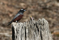
Blue Martin, maleby Shy ClickerComment: Aw, a baby bird. I think that going with the color blue rather than an interpretation that depends on the voters' knowledge of ornithology (or the title) would have been better. Nice dof. |
| Photographer found comment helpful. |
| 11/12/2008 10:28:29 AM |
|
| Photographer found comment helpful. |
| 11/12/2008 10:27:35 AM |
Into the Blueby brad177Comment: Wish the blue didn't have dark spots in it. Feels like you overcropped. |
| 11/12/2008 10:26:52 AM |
|
| Photographer found comment helpful. |
| 11/12/2008 10:25:34 AM |
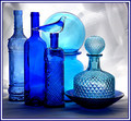
Only One Is Sealed.by jomariComment: Nice glass shot, a lot of pics seem to be having trouble with glass shots in this challenge. |
| Photographer found comment helpful. |
| 11/12/2008 10:24:58 AM |
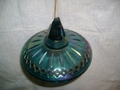
the lidby jpdoomComment: Snapshot. Light from the flash is harsh. Shadow is distracting. Don't like the wood popping out the top. Composition is boring, move the object off-center ti fix that. Object is dirty/scratched. Background is distracting with creases and would look better if it were white or black or another solid, clean color - not this off-white color. |
Home -
Challenges -
Community -
League -
Photos -
Cameras -
Lenses -
Learn -
Help -
Terms of Use -
Privacy -
Top ^
DPChallenge, and website content and design, Copyright © 2001-2025 Challenging Technologies, LLC.
All digital photo copyrights belong to the photographers and may not be used without permission.
Current Server Time: 08/12/2025 01:26:44 AM EDT.