| Image |
Comment |
| 09/03/2008 03:06:18 AM |
Sky Puppetsby jefftoews9Comment: I like your creative interpretation! Kites are like puppets on strings! I think I would have liked to see more of the standing subject's shadow rather than the empty ground on the right. I think you did the right thing here in making the horizon line so low so the ground texture would not overwhelm the kites in the empty sky. |
 Photographer found comment helpful. Photographer found comment helpful. |
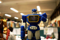
| 09/03/2008 02:59:53 AM |
Decepticon in the Office - I am Soundwaveby wxwayneComment: I like the way the main subject here is gesturing, as if he's saying "It's all about me!" I'd like to see more light hitting the front of him, though, and I'd prefer not to see him cut off right at the knee. I also feel that the image is a little unbalanced with the extra arm and empty ceiling on the left side. |
| Photographer found comment helpful. |
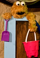
| 09/03/2008 02:52:52 AM |
Snacking Snailsby JMartComment: How fun! I love the depth of field and the soft contrasting background. I love the action captured in the shot. I wish the flower-holding puppet would have caught just a tad more light or been just a fraction higher in the frame and the left side didn't get quite as dark, but this is such a happy fun shot! I love it! |
| Photographer found comment helpful. |
| 09/03/2008 02:47:05 AM |
Portrait of A Clownby HornOUBetComment: The doll is positioned very nicely, but I struggle with the very bold costume against the very bold background. I'm almost more drawn to the background than the doll. I think a less dramatic shade would compete less with the clown costume allowing the character to really stand out. |
| Photographer found comment helpful. |
| 09/03/2008 02:43:53 AM |
Lalaby peterComment: I think you could be more extreme with the shadowing and make this a much more creative image. The shapes and textures of this composition are very smooth and basic, so I think if you're going to do this kind of contrast with the lighting, you should really commit to it. |
| Photographer found comment helpful. |
| 09/03/2008 02:20:30 AM |
Froggie Eyesby vtruanComment: I like how you've chosen a solid background in a contrasting color so that the textured fur really stands out, but I think the red is so bright that it really dominated the photo. A darker color would let the pink frog eyes be the bright spot of emphasis. Alternately, I would have liked to see more frog and less background. |
| Photographer found comment helpful. |
| 09/03/2008 02:14:40 AM |
To The Sand Pileby bobgaitherComment: The monster is cute, but I think he gets very lost in the other textured browns. I think the extreme brightness of the shovel and bucket really compound this issue and make me unsure of where to look in the photo. I like how you've attempted to capture the puppet's character by incorporating other props, but I think the photo would be better if there was less competition with the textured fur OR if there were not other bright spots so that attention could be drawn to the puppet's eyes. |
| 09/03/2008 02:03:40 AM |
Years of Tormentby CharleneComment: I think this is a difficult shot because of the extreme contrast withe the pale face and dark hair. I think it would be much nicer if the detail in the hair were retained so that there were not such huge black spaces. I think these unintended black holes distract from the face and the drama of the one eye. A more angled light or softer contrast might also help give the missing eye depth. Here I'm not sure if it's missing, colored black, or simply chopped out of the photo. If the texture in the hair were retained, I think this would be a really cool composition, because the hair, printed fabric, lace, and textured ribbon would carry a textural symmetry that really set off the smooth face and let that eye stand out--so I do appreciate where this was going! |
| Photographer found comment helpful. |
| 09/03/2008 01:52:04 AM |
L'enfant by violinist123Comment: Obviously, this is a very cool photo. To me, personally, it seems unnatural to have the doll held with this hand and the thumb facing away, so I'd like to swap arms. However, the direction of the light and the proportion of the image is excellent. |
| Photographer found comment helpful. |
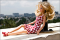
| 09/03/2008 01:44:55 AM |
Enjoy the viewby ZerosizComment: I like the contrast of the bold fashion against the subdued colors of the landscape. I think the legs are very bright and that side gets washed a bit, though, while the doll's face is still quite shaded. The pose is very lifelike, which is cool, and the doll appears very thoughtful, but I'm not sure she's aware she has such a nice view. I'd like to see her shifted to be more engaged in her environment. |
| Photographer found comment helpful. |
Home -
Challenges -
Community -
League -
Photos -
Cameras -
Lenses -
Learn -
Help -
Terms of Use -
Privacy -
Top ^
DPChallenge, and website content and design, Copyright © 2001-2025 Challenging Technologies, LLC.
All digital photo copyrights belong to the photographers and may not be used without permission.
Current Server Time: 06/17/2025 05:38:22 PM EDT.