| Image |
Comment |
| 11/22/2004 12:40:45 PM |
Beach Erosionby Mark of SRQComment: I don't really see your title, as I am used to beaches like this that aren't in danger of erosion, but perhaps your area is not this shallow... i'll give you that. :) I like the sepia, but I would prefer more dark tones and contrast. I also think the buildings are a little to tight to the edge (top left) and could use more sky above them. I like the detail in the water. |
 Photographer found comment helpful. Photographer found comment helpful. |
| 11/22/2004 12:38:38 PM |
Melting Momentsby BeetleComment: This looks like it took a lot of work! I love the perfection in the angle of the lights, great job! are you an architect? :) The lighting is not overblown, which is very nice, but it is a bit dark in the lower left of the frame of this photo. I like the photo a lot, but I think I'd like to see the background more gold/yellow or green even. Good job! |
| Photographer found comment helpful. |
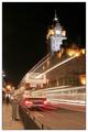
| 11/22/2004 12:36:46 PM |
The 17.20 .... Late againby agwrightComment: Excellent composition! Lighting is a bit bright, but quite appropriate. The speed is awesome. Your tilt is a little off though. Try rotating Counter Clockwise just a hair to get the garbage can/pillar and the building tower perfectly straight. nice choice of border too! |
| Photographer found comment helpful. |
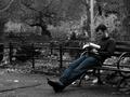
| 11/22/2004 12:34:47 PM |
Free Timeby techtraumComment: Great photo! The lighting is a tad dark, but not bad. The soft focus on the lower right is a bit eye-catching, which you may not want people to notice, but it's not bad. i love the composition, tone, and lighting! Great job overall! |
| Photographer found comment helpful. |
| 11/22/2004 12:33:34 PM |
Mother and Daughterby admart01Comment: The tones are nice, the composition would probably be better if the hands were centered though (in this case). I like the ring standing out, but not sure it shows the point of the theme. The lighting is nice too! |
| Photographer found comment helpful. |
| 10/20/2004 12:48:15 PM |
Zombieby moviemanComment: I saw your thread on "freaking hypocrits" post and i wanted to offer you my critique to maybe help you out a little.
Composition: it works well, but could be cropped a tiny bit tighter on the top and a little looser on the bottom
Color: way too blue. I would say you should warm this up a bit for a more natural look
Focus: the fingers are clear in some locations (i see one pretty clear finger nail) and a few buttons on the remote are clear, but not enough clarity in the image. The DOF is fine for the face and body, but the hand and remote should be in more focus I would prefer
Lighting: it's a tad bit dark. Esp in bottom left and behind the ear of the person.
Contrast: could use a tiny step up
Communication: TV is communication so you meet the goal
Intrigue: It's really not that interesting to me, personally. It gets the point across, but I don't particularly feel drawn to it when looking at 50 pictures around it. It doesn't catch me and draw me in.
I hope this helps you!
Best to you!!! |
| Photographer found comment helpful. |
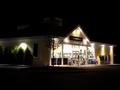
| 10/19/2004 05:57:40 PM |
24 Hour Oasisby mfairbanksComment: What a bright store! I think the color is okay here. The composition is not really to my liking. I'd prefer to see the store lower in the frame, not cropped so tightly on the left, and rotated a tiny bit counter clockwise. Also, the lighting is very bright inside, but not bright enough outside for this photo to grab me. I think a slower ISO and a higher fstop (maybe f11) would work better. Stars would be nice too! Good luck |
| Photographer found comment helpful. |
| 10/19/2004 05:55:39 PM |
Friendly Night Shadeby ty_roniComment: The tree really doesn't 'add' to the photo in my opinion. the sky is beautiful, and perhaps a silhouette of a street lamp, or something more defined and unique to your area. the tree could be a little darker though, it's still got a feeling of 'color' to it when it should be stark black against a sky like this :) Good luck |
| Photographer found comment helpful. |
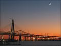
| 10/19/2004 05:54:15 PM |
Cooper River Bridgesby davidbedardComment: nice colors, great capture of the moon. The photo is not all that engaging for me unless i worked on the docks at a factory near a pretty bridge like that, but the composition is nice. |
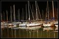
| 10/19/2004 05:53:26 PM |
Parking for the Nightby yael27Comment: i like the colors, but i am not too keen on the composition. I think I would like ot see the tops of the boats more than the mucky water. The lighting is very nice. |
| Photographer found comment helpful. |
Home -
Challenges -
Community -
League -
Photos -
Cameras -
Lenses -
Learn -
Help -
Terms of Use -
Privacy -
Top ^
DPChallenge, and website content and design, Copyright © 2001-2025 Challenging Technologies, LLC.
All digital photo copyrights belong to the photographers and may not be used without permission.
Current Server Time: 08/03/2025 09:12:38 PM EDT.