| Image |
Comment |
| 08/23/2008 03:28:18 PM |
Surrounded by Ragga2000Comment: While I've seen photos like this many, many times, I've yet to become bored with them. I wish to duplicate, but lack the geography. One day. One day. |
 Photographer found comment helpful. Photographer found comment helpful. |
| 08/23/2008 03:27:27 PM |
Coup d'oeil Pourpreby Trumpeteer4Comment: This is one of the few photos where the subtle use of the color is actually a benefit more than a hindrance. The purple play with the grey-blue eyes is stunning. |
| Photographer found comment helpful. |
| 08/23/2008 03:26:30 PM |
|
| Photographer found comment helpful. |
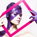
| 08/23/2008 03:26:09 PM |
color me purpleby ringComment: One of these days, I'm going to find someone willing to go through this kind of trouble to model for me. Using pink in the frame is a nice touch, although I'm thinking, due to complementary colors, that a soft Banana Yellow might have been a really nice touch. (or even something deeper, like Yellow Ochre). |
| Photographer found comment helpful. |
| 08/23/2008 03:24:50 PM |
Roxoby kanoComment: I'm loving the use of color in this image. The only knock I have for it is the seeming over-use of smoothing. I'm pretty sure that it's not hurting you much though. |
| Photographer found comment helpful. |
| 08/23/2008 03:24:04 PM |
Purple Platterby jeffffdComment: Clean, minimalistic, and definitely purple. Also, it's not a flower ;)
A very nice entry. |
| Photographer found comment helpful. |
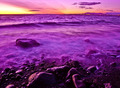
| 08/23/2008 02:11:46 PM |
Weight of the Worldsby geneward2Comment: Hello, I have made it a point for this challenge to comment on every photo that I scored under a 4.
I scored this photo a 3 for the following reason(s):
1. Focus. The over-all look of the photo is one that lacks clarity because of focus. While this is incredibly hard to achieve in a macro (which this looks to be an attempt of to me), it's best to keep trying until you achieve the clarity that DPC tends to demand. It is my experience that equipment plays a larger role in this than not.
2. Color. The use of purple here is muted and taken over by the green/pink aspects for me. When I look at this, I don't see purple. It isn't until a closer inspection that the minor purple elements show up, but by then, you've lost the vote.
|
| Photographer found comment helpful. |
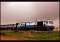
| 08/23/2008 02:08:15 PM |
A Purple in Motion..by Arpit_BakshiComment: Hello, I have made it a point for this challenge to comment on every photo that I scored under a 4.
I scored this photo a 3 for the following reason(s):
1. Lack of challenge color. Even with a longer look at this photo than the usual few-second voting pass, I fail to see any real purple in this image. The cars look like they may have been purple, but the coloring here (due to the warmth of your white balance), has been muted to the point where they are more a dark grey than purple.
2. Blur. Although your title would suggest that you were going for motion blur on the train, it really just looks like you missed the focus. You need to either put the camera on a tripod and put a lower shutter speed so that the train moves past the lens more to get more blur on the train, or you need to pan the shot so that the train remains solid, but the foreground/background are motion blurred. Either method would have resulted in a more pleasing end product for me.
|
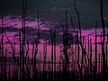
| 08/23/2008 02:04:25 PM |
Purple Ashes of Fayeby RooDysignComment: Hello, I have made it a point for this challenge to comment on every photo that I scored under a 4.
I scored this photo a 3 for the following reason(s):
1. Image size. Always try to use the maximum pixel dimensions allowed by DPC. There are tutorials on the site that should help you achieve this if needed.
2. Focus issues. The over-all feel of the photo for me is one of a lack of clarity due to a lack of focus. It also looks like a bit of over-sharpening was then applied to try and get that clarity back in post, resulting in subtle haloing.
3. Lack of focal point. It's a nice twilight scene(although I get a feeling of hue-shifting), but the sticks and bracken just serve to render the scene in chaos. I don't feel they add to the photo in any real way. |
| Photographer found comment helpful. |
| 08/23/2008 02:00:44 PM |
Bubblesby ravins4Comment: Hello, I have made it a point for this challenge to comment on every photo that I scored under a 4.
I scored this photo a 3 for the following reason(s):
1. Lack of focus. The overall image has a focus issue that leaves it without clarity and hard on the eyes.
2. Color - the feel I get when I view this isn't purple, but blue and pink. Together, they would make a purple, but for my eyes, they don't blend enough. So I don't get Purple, I get Blue.
3. Lack of focal point. The image is a little bit too chaotic for me, but that could also be a result of the focus issue. |
Home -
Challenges -
Community -
League -
Photos -
Cameras -
Lenses -
Learn -
Help -
Terms of Use -
Privacy -
Top ^
DPChallenge, and website content and design, Copyright © 2001-2025 Challenging Technologies, LLC.
All digital photo copyrights belong to the photographers and may not be used without permission.
Current Server Time: 08/03/2025 01:37:45 PM EDT.