| Image |
Comment |
| 03/04/2009 01:47:43 AM |
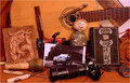
Me and my truck with interests by GlanniComment: The resulting photo here just appears cluttered. Much of the photo is shades of brown which do not make for a interesting shot. Finising some more interesting way to show these would have worked much better |
 Photographer found comment helpful. Photographer found comment helpful. |
| 03/04/2009 01:44:31 AM |
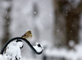
it was snowing and it was going to snowby dahkotaComment: Struggling to see how this one meets the challenge. I see no connection, in the photo or in the Title of it, to make me think this has anything to do with a person or a self portrait |
| Photographer found comment helpful. |
| 03/04/2009 01:40:32 AM |
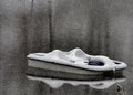
Adrift in Hard Timesby ambakerComment: The snow makes this photo look noisy when it probably isn't
The colours (shades) int his photo unfortunately are uninspiriong. Plenty could have been achieved in PP to get more out of this |
| Photographer found comment helpful. |
| 02/26/2009 11:56:38 PM |
|
| Photographer found comment helpful. |
| 02/26/2009 11:53:38 PM |
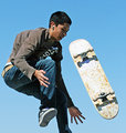
Catch Your Skateboardby eaglebeckComment: Photo is soft. Board is overexposed which could have been selectively fixed in PP. Would have preferred the ground on something else int he photo to give it context |
| Photographer found comment helpful. |
| 02/26/2009 11:52:38 PM |
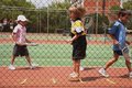
Tennis Practiseby AmmieComment: Just doesn't work for me, the wire int he way, the composition, the colours all needed improvements |
| Photographer found comment helpful. |
| 02/26/2009 11:51:47 PM |
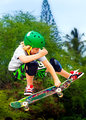
My kind of funby MaggyeComment: I love saturaation in photos, but I think you overdid it a little with this one.
I would have been tempted to isolate the kid, and desaturate the rest of the photo (the background) to black and white, which would have made this photo really work. A great capture but I think many will mark you down for the oversat...... |
| Photographer found comment helpful. |
| 02/26/2009 11:49:55 PM |
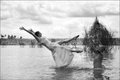
Throw Away Bride by BarbBComment: I feel she is blending in too much with the background. The black and white, while good, means she does not stand out enough against the surroundings for me. The sky has blown out elements, while the dress probably should have been whiter. Selective editing of these areas seperate would have helped, as we are under advanced editing rules |
| Photographer found comment helpful. |
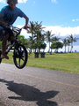
| 02/26/2009 11:47:23 PM |
Riding on Air by micheicleComment: You missed him.
Idea is good, but a shame you didn;t capture all of the rider. Even if you were going for the entering the frame look, you needed his head to be in it, and not cropped at the top |
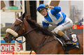
| 02/26/2009 11:45:42 PM |
CHAMPIONSby megryanComment: So, blake rode a winner in Sydney......
I feel this needed some extra Post processing. The colours seem a little boring. Upping the Contrast and a little bot of saturation make a big difference to this photo, as then the colours of the horse, the jockey and the surroundings have some punch.
A shallower depth of field also would then have helped a little, and/or some blur int he background (we are in advanced editing for this one)
The cature is good, but I don't think you got the most out of it, and that will hurt your overall mark, aas this could have scored much better. |
Home -
Challenges -
Community -
League -
Photos -
Cameras -
Lenses -
Learn -
Help -
Terms of Use -
Privacy -
Top ^
DPChallenge, and website content and design, Copyright © 2001-2025 Challenging Technologies, LLC.
All digital photo copyrights belong to the photographers and may not be used without permission.
Current Server Time: 08/11/2025 04:26:26 AM EDT.