| Image |
Comment |
| 03/25/2009 12:43:44 AM |
Latin aby biggisComment: The depth of field effect of this does not work for me. It turns the photo into a large blob of unfocus |
| 03/25/2009 12:42:59 AM |
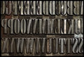
Domo Arigato, Mr. Robotoby LonzComment: Great effect with the basic composition. The angle of the numbers makes this photo, as well and the lighting applied. |
 Photographer found comment helpful. Photographer found comment helpful. |
| 03/25/2009 12:41:04 AM |
|
| Photographer found comment helpful. |
| 03/25/2009 12:40:11 AM |
upper caseby undieyatchComment: Cropping off the top and the right hand side totally distract from the photo in this case. |
| 03/25/2009 12:39:23 AM |
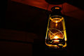
A Universal Languageby isonajComment: Music is a Universal language that doesn't matter if you understand the words or not. Great take on the challenge topic for this.
Angle is great, depth of field is great. Lighting seems to be the problem here. It is difficult to get the light right to show enough detail and not have either under or overexposed areas. The lighting is reasonable, but did need to be a bit better to get the top socres |
| Photographer found comment helpful. |
| 03/24/2009 10:45:48 PM |
|
| Photographer found comment helpful. |
| 03/24/2009 10:44:41 PM |
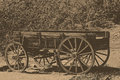
The old pickup truck.by seeComment: I know what you were trying to achieve with the processing, but it means the cart no longer stands out from the background, and therefore the impact is lost |
| Photographer found comment helpful. |
| 03/19/2009 10:43:54 PM |
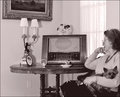
1940s News Sourceby BalkoComment: Love the processing of this, love the image. I think everything you have left here has its place, even the cropped out picture. The light is good, it all works......... |
| Photographer found comment helpful. |
| 03/19/2009 10:42:42 PM |
Torn Sprocketsby ozeradComment: Thank God!!!
Nice idea, nice capture, difficult to light this well though, and not sure about the crop here, it seems not quite right.........however, the subject is positioned correctly, so I don;t really know how I would do it to make it better |
| 03/19/2009 10:31:17 PM |
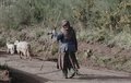
the last of the sheppardsby leniaComment: A very flat image, but that is the look that I think you were going for, and it suits the type of image and what you are trying to say here, so it works. She is a little too centred for me. I feel you needed to crop out the right hand side, have her sitting on the third line, the sheep than through the picture, with some space to the left showing where she is walking towards. Shooting further along the path (ie captureing further to the left) could have reqally made a massive difference here, and got you a really good score. |
| Photographer found comment helpful. |
Home -
Challenges -
Community -
League -
Photos -
Cameras -
Lenses -
Learn -
Help -
Terms of Use -
Privacy -
Top ^
DPChallenge, and website content and design, Copyright © 2001-2025 Challenging Technologies, LLC.
All digital photo copyrights belong to the photographers and may not be used without permission.
Current Server Time: 08/11/2025 12:42:44 PM EDT.