| Image |
Comment |
| 03/30/2009 04:55:46 PM |
Back to Basicsby Anthony_D_ArcherComment: I think your depth of field may have been a little narrow, as there seems to me to be areas of softness on some of the letters, and I feel this all needed to be sharp. Also, the colours seem to lack the punch that could have made this really pop. Idea and composition was good though |
 Photographer found comment helpful. Photographer found comment helpful. |
| 03/30/2009 04:54:18 PM |
Homeworkby gsalComment: I like the lighting in this photo, and the composition. Maybe a little more of his head (just so the border gets a little further from his eyes) would have helped, but apart from that, I like the overall effect you have created |
| Photographer found comment helpful. |
| 03/30/2009 04:52:58 PM |
The First Alphabetby bnileshComment: The light highlights on the letter for me are a little distracting, and the overall picture is very plain, without the appeal of minimalism..... |
| Photographer found comment helpful. |
| 03/30/2009 04:51:52 PM |
Sometimes it is too late to learn a new languageby ekmaiComment: Especially one where you have to learn all those different symbols Nice depth of field on this. The angle of the photo I think also works for this, and the criopping of his head also seems to work for the photo |
| Photographer found comment helpful. |
| 03/30/2009 04:50:44 PM |
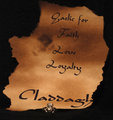
Gaelicby hjlComment: I will take your word for it on that. A different submission. I am not sure the silver thing was needed. It is too small for us to see the detail, so just became something that reflects light at the camera, and doesn't add to the photo |
| 03/30/2009 04:49:30 PM |
Language is abstractby angkokwengComment: Without the title, I had no idea how this relates to the topic. With it, it is still a stretch to make this meet the challenge. Its an interesting place to take a photograph, and I think it would have done much better if you photographed this for a topic more suited to this location |
| Photographer found comment helpful. |
| 03/30/2009 04:48:20 PM |
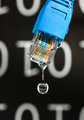
Binary; The Universal Language by Shutter-For-HireComment: I like this image. Always a question whether the numbers at the back or in the water should be the right way up? The light on the plug is a bit harsh, giving a glare to that part of the photo. Other than that, a great submission |
| Photographer found comment helpful. |
| 03/30/2009 04:47:07 PM |
Debateby animalComment: I keep coming back to this image, and skip it because I don't know how to vote it. I like the effect you have created, the lighting for the most part works well here to create the image. The negative space also works well. |
| 03/27/2009 12:29:21 AM |
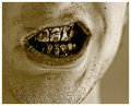
Foul Language From A Dirty Mouthby jjusaComment: I like the idea of this. The result was never going to be visually appealing though. Not sure about cropping off the chin either......... |
| Photographer found comment helpful. |
| 03/27/2009 12:28:12 AM |
I Love Youby ivale28Comment: I think it might be the shaddows, but for some reason this feels cluttered a little bit. nice idea, good use of depth of field |
| Photographer found comment helpful. |
Home -
Challenges -
Community -
League -
Photos -
Cameras -
Lenses -
Learn -
Help -
Terms of Use -
Privacy -
Top ^
DPChallenge, and website content and design, Copyright © 2001-2025 Challenging Technologies, LLC.
All digital photo copyrights belong to the photographers and may not be used without permission.
Current Server Time: 08/11/2025 03:08:22 PM EDT.