|
|
|
Showing 601 - 610 of ~1255 |
| Image |
Comment |
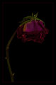
| 05/06/2009 02:36:22 AM | Forgottenby LouisaComment: Long forgotten Rose........I like the idea, the composition here is very good. I feel the rose is a touch dark. I understand that you want the overall image dark, but at least on my monitor, having it a little (just a little) lighter would have made it and its details stand out just a bit more, and would have made it better........
I like the border you have applied, simple and elegant, as a rose should be, and provides a contrast to the subject that works well |  Photographer found comment helpful. Photographer found comment helpful. |
| 05/06/2009 02:34:29 AM | Into The Depthsby HipychikComment: Great capture and great processing of this image. it meets the challenge in some way and has plently of interesting elements in it. The title helps connect to the challenge, and this was not what I expected to see in here, but it works. The lighting is well done, especially when you consider the depth in the image that needed to be correctly lit. The bubbles, they provide interest, and cut up the plain black background, but the Physics nerd in me does ask 'Where do they come from' in a scene sense (not in the blow bubbles sense) Not sure they really have a place, or maybe just in the upper area as air from the snorkel,,,,,, | | Photographer found comment helpful. |
| 05/06/2009 02:31:13 AM | Crap, I Left the Lens Cap On! ...again...by boyhuntsforblissComment: That you did.......
Something I expected to see a couple of times int his challenge, but one that does, in the end, has very little asthetically pleasing for it. The colouor elements int he image are undefinable, the internal camera reflection is the most interesting and draws attenton, but is not large enough or have enough detail to hold the entire picture together |
| 05/06/2009 02:28:55 AM | Into the Darkness Of the Unknownby JeffryZComment: A different image and not what I was expecting from this challenge. It appears that the swimmer is in broad sunlight, which makes the darkness in the top of the image seem out of place. I like the idea, but feel that the overall result does not have the overall impact that it could have. | | Photographer found comment helpful. |
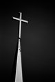
| 05/06/2009 02:24:13 AM | Steepleby ndanish18Comment: Nice, simple composition. I like the placement of the cross on this line of third. The negative space works really well for this image. The black and white is perfect for this shot. A great submission |
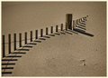
| 05/04/2009 11:01:51 PM | Dune Fence at Winter's Endby PenelopeKComment: A very interesting image. Very plain in colour, very basic, and yet extremely effective. The shapes of the fence and its shaddows cast a simple pattern that makes this image really work. The composition is really good. The border compliments the photo very well. A very good and different submission | | Photographer found comment helpful. |
| 05/04/2009 10:59:58 PM | My ray of sunshineby JudiComment: I like the idea and the composition of this shot, however, the subjects are too dark. They needed some light reflected onto them to make them stand out more, as attention is currently drawn by the background sunset as the couple are quite dark compared to the rest of the scene. A slight change int he angle they are at may also have helped, allowing us to see part of her face.
Also, what shoes is he wearing????? | | Photographer found comment helpful. |
| 05/04/2009 10:57:12 PM | Shot Heard Round the Worldby hmurmurComment: And forever changed the course of history.
The noise in the image detracts from the overall shot. It would have been hard to capture with all the smoke around in the battlescene. The man in front of the shooter adds nothing to the image, except he gets in the way of the shooter. Of course, its not a composed shot, but one taken of the action, however it does affect considerably the overall image. |
| 05/04/2009 10:53:45 PM | Saturday Night Lightsby MaggyeComment: The clouds in this photo have a fake look to them, probably as a result of the processing you have applied to it. They look as if they were drawn in. This is especially evident on the left most building. The image also lacks colour. ALl the lights are the same colour in this, and I feel you are too closely cropped in. Some extra sky, and extra water would have helped, with a possibly large view of the overall skyline. This then could have seen some reflections in the water, and the building to the right then not being cropped half off. | | Photographer found comment helpful. |
| 05/04/2009 10:50:40 PM | The Harbor of Evergreen Lightby alfrescoComment: I find the processing of this image is a little overdone, giving the entire image a fake feel to it. This is most evident in the foreground water and the coast line. While it may have been the effect you were after, it doesn't work for me. I like the subject. Perhaps a little extra space on the right might have balanced the shot a little better | | Photographer found comment helpful. |
|
Showing 601 - 610 of ~1255 |
Home -
Challenges -
Community -
League -
Photos -
Cameras -
Lenses -
Learn -
Help -
Terms of Use -
Privacy -
Top ^
DPChallenge, and website content and design, Copyright © 2001-2025 Challenging Technologies, LLC.
All digital photo copyrights belong to the photographers and may not be used without permission.
Current Server Time: 08/12/2025 05:32:58 AM EDT.
|