| Image |
Comment |
| 10/01/2008 03:30:15 AM |
Let me sleep in!!!by cloe15Comment: Overexposed area on the sheet, although there for the effect of the sun shinning through the window, is a little overdone and distracting for me. Photo looks noisy, skin tones don't look right to me, she is very orange, and the clashing colours also put me off. Pink?orange/Yellow/Brown all together I don't think has worked. |
 Photographer found comment helpful. Photographer found comment helpful. |
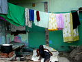
| 10/01/2008 03:28:22 AM |
Washdayby LinithComment: Interesting pattern made here which makes for an interesting photo. Great use of colour as well.
I would have been tempted to mismatch all the PJ's in this, therefore having non matching top/pants on each line. |
| Photographer found comment helpful. |
| 10/01/2008 03:26:10 AM |
Pajama under Pajama'sby aditiComment: Would prefer you to use maximum available width to make viewing photo easier. Photo looks out of focus here. |
| 10/01/2008 03:24:57 AM |
Blooming Pajamas Party by StructorComment: Clever Idea, and one that stands out. Ofset gives the photo more here (instead of being just a frame seperated into shapes) so works well. Slight uneveness of the light also seems to work, however the bottom left seems a little washed out (faded) looking as a result. |
| Photographer found comment helpful. |
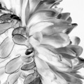
| 09/25/2008 11:20:50 PM |
Flowerby hajekaComment: I am not a fan of the overexposed look here. Overexposed alwasy washes out the colour, which is the opposite to what I would think you are meant ot convey with this challenge |
| Photographer found comment helpful. |
| 09/25/2008 11:19:49 PM |
Delicate Beautyby starrliteComment: The Challenge demanded that the photo was black and white, whereas this is still colour.
Photo is good, and would have scored much better had you made it balck and white. |
| Photographer found comment helpful. |
| 09/25/2008 11:18:32 PM |
|
| Photographer found comment helpful. |
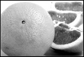
| 09/25/2008 11:16:03 PM |
Orangeby LonzComment: Not sure about the overexposed slices in the background, and I am not sure the border adds to the photo |
| Photographer found comment helpful. |
| 09/25/2008 11:14:58 PM |
National Colorsby antares1966Comment: I don't like the crop, the blue should be grey and not black, and the starts should be white and not grey |
| Photographer found comment helpful. |
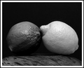
| 09/25/2008 11:13:52 PM |
Lemon and Limeby cryanComment: Like the idea. The lemon is lit reasonably well, but the lime is not. Needed more light on its lower side as it disappears. The contrasting greys though give the impression of colour |
| Photographer found comment helpful. |
Home -
Challenges -
Community -
League -
Photos -
Cameras -
Lenses -
Learn -
Help -
Terms of Use -
Privacy -
Top ^
DPChallenge, and website content and design, Copyright © 2001-2025 Challenging Technologies, LLC.
All digital photo copyrights belong to the photographers and may not be used without permission.
Current Server Time: 08/04/2025 08:11:35 PM EDT.