| Image |
Comment |
| 10/22/2008 08:17:30 PM |
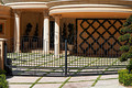
Park Place 90210by lynnesiteComment: The close crop of this area does not show the size or granduer of the place. A wider view showing a large, sprawling Place might of worked better than this. |
 Photographer found comment helpful. Photographer found comment helpful. |
| 10/22/2008 08:16:25 PM |
I Win!by eyesdownComment: Not sure about the angle of this photo. His Back is in focus, the rest of the photo isn't, so that eyes get drawn to the plain, blue area. I think it would have been better if his haands etc were the focus, his back could then have been soft, and our eyes would have been drawn to his hands (and the soft guy beyond them) giving the photo more of an effect |
| 10/22/2008 08:14:22 PM |
|
| Photographer found comment helpful. |
| 10/22/2008 08:13:23 PM |
German Engineeringby bruskiComment: A good classic capture of Precision German Engineering. The colour in the background is great. |
| Photographer found comment helpful. |
| 10/22/2008 04:04:47 AM |
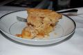
The Upper Crustby bj0920Comment: Different take, but I feel the Depth of field is wrong. Much of the Upper Crust in the photo is out of focus as the focus is the front of the pie, where the upper crust is less evident |
| 10/22/2008 04:03:32 AM |
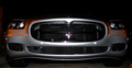
Brand New Maseratiby RasaiComment: The angle of the photo does not work for me. I would prefer a higher view where we were looking up the bonnet as well, or instead a different angle that shows the lines of the car, both its bonnet and the sides. The lighting also does not flatter the car. |
| Photographer found comment helpful. |
| 10/22/2008 04:01:22 AM |
untitledby JakerComment: Not a fan of the lighting in this photo. The overall photo is not interesting. The lack of a title means we are unable to see where you are coming from with this. The White/Black changhe in the photo does not work |
| Photographer found comment helpful. |
| 10/22/2008 03:59:37 AM |
Style and Elagance watching You!by danielcheong1974Comment: To me, the numberplate , as a result of the lighting, colour and crop is the dominent focus of the photo, rather than the Mercedes Badge or the Car in general. This detracts from the photo and the message. I dopn't think the tight crop works here. This photo needed more of the bonnet, and the tight crop on the sides does not work. Panoramic Crops also have a history of not scoring well here. The lighting though is the big thing. Better lighting is needed to get the eyes to notice the car, or the badge, instead of the number plate, as the main theme. |
| Photographer found comment helpful. |
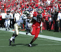
| 10/22/2008 03:32:36 AM |
Joy of the gameby lukeisleyComment: Not really sure how this meets the challenge, but ignoring that.......
A narrower depth of field would have blurred the crowd more, and those standing ont eh touchline. As a result, it would have made the players stand out more, rather than blending intot he background a little.
The title doesn't seem to match the photo. Doesn't show a lot of joy. Shows soemone about to lay a tackle (or miss the tackle)... |
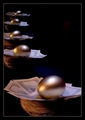
| 10/22/2008 03:28:59 AM |
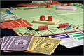
Accumulating wealth by BudyaComment: Like the idea, the curving nests work (much better than if they were straight). Depth of field is really good. I like the lighting of it as well. I probably would have had the front nest though all in the picture, instead of cropping off the right hand notes, but would still of had the egg to the right hand side of the photo. A little bit more room both the left and right side for me.
But thats all minor. Great idea and good execution. Well Done! |
| Photographer found comment helpful. |
Home -
Challenges -
Community -
League -
Photos -
Cameras -
Lenses -
Learn -
Help -
Terms of Use -
Privacy -
Top ^
DPChallenge, and website content and design, Copyright © 2001-2025 Challenging Technologies, LLC.
All digital photo copyrights belong to the photographers and may not be used without permission.
Current Server Time: 08/05/2025 05:40:26 PM EDT.