|
|
|
Showing 151 - 160 of ~770 |
| Image |
Comment |
| 06/19/2009 11:57:47 AM | Geodesic Sunsetby thatsanicepictureComment: Greetings from the Critique Club :)
Composition:
For me the sunset area is a little too low in the scene and I think this would have looked really nice had the camera angle been slightly lower, that would have resulted in the darker area at the top being out of the frame too which i think would have added to the image, I think the Hexagon shapes are amazing and with that sunset in the background there was the making of a seriously good challenge entry here (although I think it might be a stretch for Architecture for the voters on this site).
Camera Work:
Everything looks to be in order, nice use of high ISO to get the shot and well retained details in the sunset.
Post-Processing:
Not too heavily saturated which is good as I suspect it would have been very easy to get carried away processing that sky.
My Opinion:
Nice out of the box thinking and I reckon in the right challenge this location has the potential to produce a shot that could finish very high, there's some lovely shapes formed making for a very interesting capture. This one probably fell a bit in score due to the subject matter and the voters expecting to see a building or very specific types of structure (pretty much a given when looking at the results).
Good luck in future challenges!
Mark |  Photographer found comment helpful. Photographer found comment helpful. |
| 06/18/2009 03:16:27 PM | original.jpgby LutchenkoComment: Sorry about your DQ Will seriously that sucks, I cannot see the point in question so cannot comment on how I feel about the DQ itself, what I can tell you is this original image is 10x better than the edit LOL Sorry but this would have won with practically no editing IMO Message edited by author 2009-06-18 15:16:53. | | Photographer found comment helpful. |
| 06/18/2009 10:13:43 AM | Jettyby pinetree3Comment: Greetings from the Critique Club :)
Composition:
I quite like the centered Jetty but feel the boat? on the right is fighting equally for my attention and keeps pulling my eye, there's not much interest in the boat so my eyes lead back to the fishermen at the end of the Jetty but still constantly get drawn to the boat, so IMHO a slightly different angle to eliminate the boat might have worked better. The sky is beautiful and I love the 2/3 horizon line it's perfect. I wonder if taking the shot so that the Jetty put a diagonal line across the image with the wonderful SF skyline in the background would have worked? Can't decide either way so if you are ever back there please take a shot and let me know :)
Camera Work:
Looking at your settings here you have done an amazing job, I know the 20D can struggle in certain conditions beyond ISO400 so the use of the ND grad and your bracing the camera on the post was a job well done.
Post-Processing:
Wonderful stuff really, would have been so easy to pump the Sat and oversharpen this one, but you have held off nicely and retained a very realistic feel to the image, there's good contrast and tonal range from top to bottom so very well done IMO.
My Opinion:
Super location, wonderful sky, nicely controlled camera settings - I think you did a very good job and met the challenge well, this easily deserved it's 6+ score
Good luck in future challenges!
Mark | | Photographer found comment helpful. |
| 06/18/2009 09:27:14 AM | Almost forgot that granite is a stone!by TammsterComment: Greetings from the Critique Club :)
Composition:
I guess with this subject so closely framed there's not much that can be said about the composition as such, some areas in the shot do seem to have a bit more interest than others though so maybe a different crop would have worked slightly better.
Camera Work:
The focus seems a little soft I suspect this may have been handheld and I wonder if that 8 shutter speed was actually 1/8, pushing the ISO would have enabled a faster shutter which would have resulted in an overall sharper image I feel.
Post-Processing:
Unfortunately you haven't listed your processing steps so I cannot see what was done to the shot, I've taken the image into PS and found that with a boost to Hue / Sat and some contrast tweaks the colour are quite delightful and the browns glow almost golden like, I also added some sharpening and this helped with the focus issue considerably - it might be worth going over this image again and reprocessing it to see what improvements you can make.
My Opinion:
I think your subject matter was always likely to result in a low score unfortunately, even with perfect lighting and focus I think your options were fairly limited. But as you say in your notes you refound your "sight" on something not appreciated as much as it once was.
Overall a applaud your decision to go with a shot that had meaning to you and also the fact that you did so pretty much knowing it would result in a lower score, keep on shooting!
Good luck in future challenges!
Mark | | Photographer found comment helpful. |
| 06/18/2009 07:53:21 AM | Stone's Archby alinaComment: Greetings from the Critique Club :)
Composition:
The composition elements in the shot are actually quite nice the rule of thirds appears to be followed with the right hand wall line of the arch, I think a stronger composition could be achieved with a crop to the top so that the upper edge of the wall is not seen, this takes away the distractions in the upper part of the image and focuses the eye down on to the bench more.
Camera Work:
Exposure and focus seems pretty good and there appears to be good tonal range within the image.
Post-Processing:
I REALLY like the low Hue / Sat feel of the image and with the crop I mentioned above I think the image is almost fairytale like, I also think a little sharpening and a Shadow / Highlight tweak would enable you to pull out a touch more detail in the stone work.
My Opinion:
An interesting take on the challenge and the spotting of the wonderful lighting on the bench was a good catch.
Overall a nicely different take on the challenge, congratulations on putting your first entry out there to the voters don't let the low score put you off entering more, it's just a matter of working out what the voters want, by voting and commenting on challenges I am sure you will pick this up very quickly.
Good luck in future challenges!
Mark |
| 06/18/2009 07:28:43 AM | Toronto Fun Guideby Art RoflmaoComment: Hahaha this is hilarious.
It almost looks like the evolution of ArtRoflmao in steps from right through to left ;) | | Photographer found comment helpful. |
| 06/18/2009 06:53:30 AM | The power within the architecture.by MitzenfaukerComment: Greetings from the Critique Club :)
Composition:
The composition is a actually very nice I love the leading lines right through the image, although rule of thumb is they should normally lead in rather than out of the shot (I think it's more an impression of the lines leading out within this shot as the cables running across the shot converge with the ones leading down and in to the scene).
The depth achieved within the shot is really quite excellent as the pylons move away in to the background, with the mountains giving the final pale layer way back there in the distance.
Camera Work:
I'm not sure if the settings posted are correct, but if so I am not sure why those particular settings would be used. For landscapes f2.8, 400 ISO and 6400 shutter just do not seem to add up and looking at the image I have to wonder if these settings have been incorrectly listed.
I'm going to assume they are listed correctly for the sake of the critique and suggest maybe more standard settings for a landscape such as this would be ISO 100 and an f-stop around f11 - f16 as there does not appear to be anything of signifance moving a very fast shutter is not really necessary.
Post-Processing:
I REALLY like the acid like toning feel to this image, kind of subdued saturation and pale colours work so well here. Sharpening has been nicely controlled with all those thin lines it would have been easy to introduce large amounts of Jaggies.
My Opinion:
Maybe a bit of a stretch to think of this as Architecture for most people, although it has great form and is nicely presented and in leading lines kind of challenge would most likely have scored much higher. I wonder if the very dark foreground cost you some points because had that been a bit more detailed there would have been more of a focal point for the viewer as I find myself straining to see what detail there is in that area.
Overall a nicely different image for the challenge but all things considered it probably finished about right for this particular assignment, however entered in a more fitting one could have done rather well IMO.
Good luck in future challenges!
Mark |
| 06/18/2009 05:52:33 AM | What the lens seeby EpsiComment: Greetings from the Critique Club :)
Composition:
The composition is a difficult one to dissect here really, you have used the rule of thirds with the side of the lens which should work well and I guess it does really, the shot looks complete from an "elements in the right place" kind of perspective. The eye is drawn across the image nicely to what is the main subject in your shot, so from that we can assume the goal was achieved.
I personally think you hit the nail on the head with your comment about the reflections being a bit too distracting, had we the viewer just been able to see the very interesting tall building without all the other overlapping reflections I think your score could have been considerably higher. One thing I am not sure about is did you achieve this shot through shooting in to a mirrored surface?
Camera Work:
Considering I am not 100% sure whether this is a reflection or a shot of someone else holding a camera it's a difficult one to call, because of the softness of the detailing on the outside edge of the lens I tend to think it's a reflection so overall you have done pretty well in testing conditions. I might consider pushing the ISO and so achieving a faster shutter.
Post-Processing:
You've managed to pull out the colour in the building which is reflected in the lens pretty well, there's not really much I can see wrong with the processing as I think you would have been very limited in what you could achieve from the original image.
My Opinion:
To be honest I think had you taken a creative image directly of the building in your shot you may well have got some seriously good results as it appears to have some wonderful tones and colours and also seems very interesting in construction, but I do applaud you for taking the plunge and stepping outside of your normal style, unfortunately being different on DPC can yield some very low scores, that's not necessarily a bad thing it just means that your style and what the voters want do not meet, for what it's worth I was one of your 5 scores.
Good luck in future challenges!
Mark | | Photographer found comment helpful. |
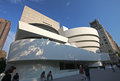
| 06/18/2009 05:03:43 AM | The Guggenheim by Frank Lloyd-Wrightby EssAreDubyaComment: Greetings from the Critique Club :)
Composition:
For me personally I think the building is a little too centered and the tilt works against the shot as a whole making it look a little awkward, I'm not sure if the building in the back is part of the main subject so allowing this room but cutting the bottom of the subject seems like a strange decision (although maybe that was to minimise the impact of the distracting woman walking in to the shot). I like the very acute lines contrasting the curves in the upper half of the shot, but wonder if there was a more interesting angle shooting from the other side? I've never been there so only going by what I can see, it's a shame about the people within the shot as it makes your image feel a little snapshot like, it doesn't look overly busy and I wonder if waiting around for a little while would have given you a shot without so many human distractions (but then again maybe it was busy and you did wait for this lull? if this is the case then apologies).
Camera Work:
The technicals look pretty good, it's sharp, nicely exposed and well focused.
Post-Processing:
I am slightly confused by the USM majorly faded comment and not totally sure what this means, my first impression was a duplicate layer, heavily sharpened and then the layer opacity reduced (which is a technique I have used before) but I'm pretty sure this would not be legal in Basic editing.
Other than that point, I think the editing is pretty good, the saturation is nicely done and there's good contrast through the scene.
My Opinion:
I quite liked the image when I saw it in voting, but my immediate reaction was that maybe you had missed an opportunity of capturing a great shot, I think exploring this amazing building could have resulted in some seriously good shots that may well have contended for a slot on the front page, the shapes within the building itself are awesome and some creative angles could have yielded almost endless opportunities.
The strong shadows to the bottom half and the dotted people in the shot unfortunately are just a bit too much of a distraction so I think the score was just about right for the shot entered this time round.
Good luck in future challenges!
Mark
ETA: Spelling corrections Message edited by author 2009-06-18 05:07:33. |
| 06/17/2009 06:56:54 PM | High in the Skyby dahvedComment: Greetings from the Critique Club :)
It's going to be tough for me to add anymore than I did on my initial comment for this shot really, but I will try:
I really like this shot, I like the position of the arch and the way the sky is almost separated by it, the dark forboding left side is mirrored by the shadow of the arch which works so well.
I think the reasoning I made about it not screaming the challenge subject still stands regarding the received score and I am pretty sure you are aware of that, you've been here long enough to know the situation with the voters :)
All in all a very brave entry, a very valid entry even though it didn't overly connect with the voters, I think it's the sort of image that will connect really well with a select crowd and that sometimes is more rewarding than shooting something purely to score well over taking and entering a shot that you both like and enjoy at the moment of capture.
Good luck in future challenges!
Mark | | Photographer found comment helpful. |
|
Showing 151 - 160 of ~770 |
Home -
Challenges -
Community -
League -
Photos -
Cameras -
Lenses -
Learn -
Help -
Terms of Use -
Privacy -
Top ^
DPChallenge, and website content and design, Copyright © 2001-2025 Challenging Technologies, LLC.
All digital photo copyrights belong to the photographers and may not be used without permission.
Current Server Time: 07/18/2025 09:36:45 AM EDT.
|