| Image |
Comment |
| 04/30/2012 12:09:45 AM |
|
 Photographer found comment helpful. Photographer found comment helpful. |
| 04/23/2012 06:27:58 PM |
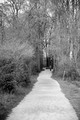
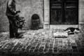
Decisionsby RowanNComment: Greetings from the Critique Club :)
Composition:
It's ok although something seems a tad wrong, I can't quite put my finger on it but I wonder if the scene is actually like this - to comply with the rules (as I understand them) you would have had to have taken the shot of the two people with the camera in the same position and for the scene to be one - to my eye it looks like the fork might be two different locations although I could be way off the mark :)
Technicals:
Assuming the scene is a single scene capture and for the purpose of the critique I will assume it is one complete scene, the shot is quite well taken, there seems to be fairly good focus but the left hand person seems a little flat.
Post-Processing:
I assume from your notes that there was not much editing done however I do think the shot would have benefitted from a little more contrast and quite a bit of sharpening, I am not sure if this would have bought more detail out in the main tree in the image though and for some reason I keep being drawn to this area and to me it seems there should be some detail in the bark but there is very little other than shadows so my eye is left wanting here especially.
My Opinion:
I like the idea I just think you need to work on the execution a little and then on your post processing, however this kind of shot could well see you getting Posthumous ribbons when the technicals are up to par.
Hope this was of some use, should you wish to discuss any part of the critique further please feel free to PM me.
Good luck in future challenges!
Mark |
| Photographer found comment helpful. |
| 04/23/2012 06:04:47 AM |
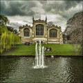
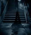
The River Hizby MAKComment: Greetings from the Critique Club :)
Composition:
Love this shot mate love the composition, love the interest of the people and the centre image format with the trees as stoppers either side and the central water fall leading the eye in to the building.
Technicals:
Focus is spot on as always with good DOF front to back.
Post-Processing:
Your style to a tee, good colours, good contrast and nice tonal range.
My Opinion:
No idea why this scored and placed so low, I didn't vote but this would have had a 7 all day long.
Hope this was of some use, should you wish to discuss any part of the critique further please feel free to PM me.
Good luck in future challenges!
Mark
PM me about a day out mate :) |
| Photographer found comment helpful. |
| 04/23/2012 05:57:55 AM |
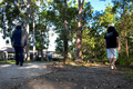
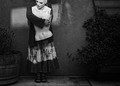
New adventure just around the corner.by TJBrownComment: Greetings from the Critique Club :)
Composition:
Personally I think there is a little too much on top of this image and I would probably cropped out about a third of the image off, I feel this gives a stronger composition and brings the attention down to the main focal point in the shot namely the person in the distance.
Technicals:
Focus looks pretty good in the distance I might have liked a little more focus at the front of the shot although sharpening might help on this aspect anyway.
Post-Processing:
I assume from your notes that there was not much editing done however I do think the shot would have benefitted from a little more contrast and some sharpening.
My Opinion:
I like the fact the shot is in B&W I like the idea of it too, overall a nice image.
Hope this was of some use, should you wish to discuss any part of the critique further please feel free to PM me.
Good luck in future challenges!
Mark |
| Photographer found comment helpful. |
| 04/21/2012 07:47:30 AM |
|
| Photographer found comment helpful. |
| 04/21/2012 07:47:14 AM |
City blues by zarkoComment: Bumping, my only 10
Great shot lovely processing and a nice feel to the image |
| Photographer found comment helpful. |
| 04/21/2012 07:42:39 AM |
Body Imageby MelethiaComment: LOL Melethia 2 entries at the same shoot very nice :)
This shot is not as strong as the other one IMO and the light looks to have gone a little flat.
Score: 5 |
| Photographer found comment helpful. |
| 04/21/2012 06:50:48 AM |
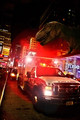
Tyrannosaurus in Times Squareby SebiComment: Nice and creative shame there wasn't someone running alongside the ambulance to create a sense of panic but still nice for the theme. Would have liked a little less grain and a bit more sharpness on the front end of the image if I had to find a nitpick.
Score: 7 |
| Photographer found comment helpful. |
| 04/21/2012 06:48:22 AM |
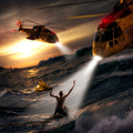
Saved by the Lightby gyabanComment: My Favorite of the challenge if I am really critical I find the guy on the log a little awkward and maybe should have been positioned a little lower in the water but that's just if I had to find a nitpick.
My 1st place and highest score 9 |
| Photographer found comment helpful. |
| 04/21/2012 06:46:17 AM |
FEUERWEHRby GilesComment: If only you had taken a shot of a real street and superimposed the toys in to that you'd have had a cracking shot IMO - the cloth distracts from an otherwise really well lit scene. |
| Photographer found comment helpful. |
Home -
Challenges -
Community -
League -
Photos -
Cameras -
Lenses -
Learn -
Help -
Terms of Use -
Privacy -
Top ^
DPChallenge, and website content and design, Copyright © 2001-2025 Challenging Technologies, LLC.
All digital photo copyrights belong to the photographers and may not be used without permission.
Current Server Time: 07/18/2025 06:50:45 AM EDT.