DPChallenge: A Digital Photography Contest You are not logged in. (log in or register
 
Browse Settings
Currently viewing:
Registered UserJC_Homola

Show comments:

Per page:

Order:

Comments:


Comments Made by JC_Homola
Pages:   ... [139] [140] [141] [142] [143] [144] [145] ... [171]
Showing 1411 - 1420 of ~1709
Image Comment
It's better to have loved and lost than never to have loved at all
11/26/2003 02:43:43 PM
It's better to have loved and lost than never to have loved at all
by heida

Comment:
Greetings from the critique club.

Hi,

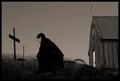
This is a very powerful image. Agrees with the challenge and is appropriate to the title.

Your use of a monochrome treatment works really well for this topic.

I find myself agreeing with Zeuszen, quite possibly a first ;}.
The prominence of the chapel does detract from the impact of the figure and marker.

A shallower depth of field or use of judicious blurring may help bring the focus back to the central figure.

I like the composition so would not want to get rid of it all together. It does add to the piece as a whole.

There is a lot of tension and a dark mood/tone. Again something I find very appealing in an image. Especially one done with the purpose of conveying a specific theme.

Darkness for the sake of darkness is all well and good, and you know I do enjoy images that are underexposed or intentionally lacking in bright highlights.

This image, is more than gratuitous darkness, the lack of highlighting is in itself an element. My eye wanders the image seeking more information. I wonder if I look closer will I see more in the grasses? Will I see a name on the cross, etc etc.

I love images that make me do that.

Congratulations on a very fine entry.

peace,
JC
Photographer found comment helpful.
Religious Propaganda
11/26/2003 10:42:51 AM
Religious Propaganda
by melongrind

Comment:
I was just running through some of my favourites from this challenge.
I'm sorry you recieved so many low votes. This image deserves better.
Photographer found comment helpful.
Be yourself, Be different, Stand out!
11/26/2003 10:33:03 AM
Be yourself, Be different, Stand out!3rd Place
by KING

Comment:
Congratulations on the first ribbon, many more to come I think.
Photographer found comment helpful.
Smoking is Dead Sexy
11/26/2003 10:31:35 AM
Smoking is Dead Sexy1st Place
by TechnoShroom

Comment:
Congratulations, well deserved.
An Unfortunate Cookie
11/26/2003 10:30:59 AM
An Unfortunate Cookie2nd Place
by thelsel

Comment:
Congratulations! Well deserved.
Photographer found comment helpful.
Jam on the Brakes
11/26/2003 10:05:26 AM
Jam on the Brakes
by Natator

Comment:
Greetings from the Critique Club

Well,,, I do believe you've pretty well summed up your image in your comments.

Improvements? I'm assuming the red in the upper left corner is part of the Bike? The fender or some such? For that colour and extra diagonal to not be there is the only thing I can see to change.

As an American, I did know what the phrase was. We do say that here.

Great shot.

JC
Photographer found comment helpful.
New Crayons
11/26/2003 09:54:04 AM
New Crayons
by stargazer

Comment:
Unique subject. I could immediately remember the smell from when I was young. I lke how this fills the frame, good detail. Some of the focus is a bit off and this probably should have been a shot where everything was very sharp. 7
Photographer found comment helpful.
The Cuban aroma
11/26/2003 09:50:07 AM
The Cuban aroma
by Jason

Comment:
Very nice. May have been a bit stronger if the smoke was more defined nearer the cigar. 8
Photographer found comment helpful.
Fragranced
11/26/2003 09:49:12 AM
Fragranced1st Place
by sahko

Comment:
Simply stunning, the only comment I would make is the face area could be tidied a bit post challenge. Smooth it just a little. Otherwise, shot of the challenge in my opinion. 10
Photographer found comment helpful.
Black & White(thinking) & Red (causes suffering) all over
11/25/2003 05:00:15 PM
Black & White(thinking) & Red (causes suffering) all over
by vrphotos

Comment:
Very good, and so timely. I think this would have been a bit better with out the handle with care,, while I think I understand your reason for including it, it does add one too many elements.
I also might have had all the signs in black and white except for th fragile and background. That would have given a more conitinuous theme. 9
Photographer found comment helpful.
Pages:   ... [139] [140] [141] [142] [143] [144] [145] ... [171]
Showing 1411 - 1420 of ~1709


Home - Challenges - Community - League - Photos - Cameras - Lenses - Learn - Help - Terms of Use - Privacy - Top ^
DPChallenge, and website content and design, Copyright © 2001-2025 Challenging Technologies, LLC.
All digital photo copyrights belong to the photographers and may not be used without permission.
Current Server Time: 09/01/2025 11:11:48 PM EDT.