| Image |
Comment |
| 01/26/2004 09:23:48 PM |
|
| 01/26/2004 09:23:35 PM |
|
 Photographer found comment helpful. Photographer found comment helpful. |
| 01/26/2004 09:23:15 PM |
|
| 01/26/2004 09:22:57 PM |
Painted Ceilingby paganiniComment: The Chihuly exhibit?? ahh was this the ceiling that had the flashing lights???hmm
7 |
| 01/25/2004 06:59:25 PM |
Moon Through Frosty Windowby magnusComment: Greetings from the Critique club
This is a really interesting abstract image. I like the black and white.
It is so hard to tell what anything really looks like in this small size. I wish there was a way to see things larger.. anyway.
The one thing I find distracting is the moom. It is so overexposed it does detract from the overall dark quality of the image.
Is it possible that if you had been at a little more of an angle the frost would have glistened and you could have avoided the burn out?
Just a thought.
Overall a very nice image. |
| Photographer found comment helpful. |
| 01/25/2004 06:48:40 PM |
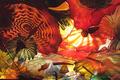
Energy Sources at sunsetby bgartside47Comment: Greetings from the critique club.
This shot has a lot of potential. The way you used the sun for a dramatic affect is quite good. If only you had been able to be in a position to have it a bit more obscured by the tower.
There is too much dark foreground. Eiter crop it or use a different angle.
I see where you mentioned you had to be careful not to get caught. I imagine this didn't allow you a lot of time to compose and wait for better conditions.
Still a good image, that maybe you will be able to revisit. |
| 01/25/2004 06:44:27 PM |
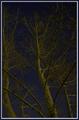
Trees & Starsby Spanish_GreaseComment: Greetings from the Critique Club.
I love this shot. I think the POV is really good, the colours are interesting and your DOF really works.
The problem? It needs to be brighter or have more contrast or both.
I think that would make this an excellent image. |
| Photographer found comment helpful. |
| 01/21/2004 12:28:51 PM |
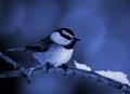
My Little Chickadeeby vtruanComment: Greetings from the Critique Club.
First let me thank you for YOUR critique of my image, a couple of challenges ago.
This is a lovely little shot. There is nice detail and it is well composed.
I would wish for a bit more detail on the eye though, is this a product of the post processing? That is the only thing I see that is detrimental. If we could see it better I feel this shot would have done much better.
JC |
| Photographer found comment helpful. |
| 01/21/2004 12:25:52 PM |
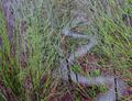
A Snake in the Grassby ellamayComment: Greetings from the critique club.
I would get this one... I hate snakes and in fact when I saw the title I almost closed it so I wouldn't have to look... good thing I stuck it out.
Nice shot. Very interesting abstract. I still can't quite tell what it is.
Good composition. But I think the main issue is the light. It's just a bit flat and because of this, cause the contrast to low.
This is a wonderful subject and I'd love to see it reshot with different light. Was this a cloudy day? A few shadows might add another element that would elevate the image.
Still, a very fine shot.
JC |
| Photographer found comment helpful. |
| 01/19/2004 12:12:15 PM |
More of this...Less of that!by spydrComment: Greatings from the Critique Club.
I think this is a very well done image. I like the concept, use of Black and White, the mirror.
The composition could use a little tweaking. Possibly a little less negative space, right foreground. THe DOF is right on.
Well done in my opinion.
JC |
| Photographer found comment helpful. |
Home -
Challenges -
Community -
League -
Photos -
Cameras -
Lenses -
Learn -
Help -
Terms of Use -
Privacy -
Top ^
DPChallenge, and website content and design, Copyright © 2001-2025 Challenging Technologies, LLC.
All digital photo copyrights belong to the photographers and may not be used without permission.
Current Server Time: 09/02/2025 05:46:38 PM EDT.