| Image |
Comment |
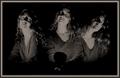
| 06/19/2003 08:27:03 AM |
Me Myself and Iby grigrigirlComment: This is one of my favorites. I think it's because of the concept, but also the lighting you used. It reminds me of a silent-movie startlette. Could have been centered just a little bit more. There seems to be a bit more space on the left than the right and in a composition shot like this, it's symmetry is important. |
 Photographer found comment helpful. Photographer found comment helpful. |
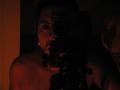
| 06/19/2003 08:20:46 AM |
Kiss me!by sylkComment: I know you were going for humor, but had you chosen to make this just a classic portrait, it would have been even better. I love your framing and the lighting. It highlights your hair and the way your bangs fall across your face exposing only one eye is very attractive. Speaking of your eye, you beautifully captured the color. |
| Photographer found comment helpful. |
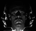
| 06/19/2003 08:18:18 AM |
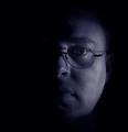
a candle, a cameraby daemoniComment: I'm told the problem may be my monitor but truly, all I see in this is what looks like it might be an earring. Everything else is so dark, I can barely even see any shape or form. |
| 06/19/2003 08:16:02 AM |
Whiteby rll07Comment: This is so nicely done, it looks like it could be an advertisement in a magazine. I like your choice of white on white because it makes YOU stand out all the more. |
| 06/19/2003 08:14:40 AM |
Searching......by ReneeComment: This is really nice. It's a picture that could tell a story. Where are you? What's are you looking at? Is there something outside that window or are you daydreaming and the window is merely where your eyes are turned? Are you waiting for a beau, all dressed up with your hat on, ready for a spring picnic? I love pictures that foster the imagination. This is just lovely. |
| 06/19/2003 08:11:32 AM |
Rule of Thirdsby robsmithComment: Interesting. A little more light on the center shot would have been better I think, but all in all, I like it a lot. |
| 06/19/2003 08:10:37 AM |
Is This Really Me?by mcraelComment: I'm no expert, but I personally would have liked a little more light on you. The backdrop seems brighter than the subject. I like that you are a tad off-center in the framing. |
| 06/19/2003 08:04:56 AM |
|
| Photographer found comment helpful. |
| 06/19/2003 08:03:23 AM |
|
| Photographer found comment helpful. |
| 06/19/2003 08:02:59 AM |
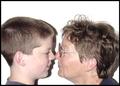
My grandson is taller than me.by cathysappComment: This is really a cute shot. I would have preferred lighting that might have eliminated the shadow. It's a little distracting but other than that, I love it. |
Home -
Challenges -
Community -
League -
Photos -
Cameras -
Lenses -
Learn -
Help -
Terms of Use -
Privacy -
Top ^
DPChallenge, and website content and design, Copyright © 2001-2025 Challenging Technologies, LLC.
All digital photo copyrights belong to the photographers and may not be used without permission.
Current Server Time: 08/04/2025 08:25:02 AM EDT.