| Image |
Comment |
| 09/29/2003 07:14:03 AM |
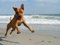
happy landingby dc broughtonComment: This is a creative and amusing take on the challenge theme. You captured him at just the right moment with the ears looking like little wings, and what a great expression on his face, looking straight into the camera. Good job. |
| 09/29/2003 07:11:23 AM |
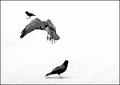
Descentby TarbiniComment: This is nifty. I'm glad you made it black and white. I think I'd lose the little guy on the top left. I think he's a little distracting from the bird in flight. Nevertheless, I like this a lot. If I could vote in this challenge, I'd give you an 8...and then probably reconsider and up it to a 9 or 10. LOL! Good luck. |
 Photographer found comment helpful. Photographer found comment helpful. |
| 09/29/2003 07:07:51 AM |
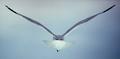
"No Limits"by vtruanComment: I love the near-prefect symmetry, the grey-blue tones, teh softness of the feathers. I think the darker sky on the right is perhaps a little distracting--maybe if the sky held the same symmetry as the bird? I dunno. I guess I'd have to see what that would look like to compare before I say for sure if that would improve an already terrific shot. Can't give you a vote, but if I could it'd be a 10. Good luck! |
| Photographer found comment helpful. |
| 09/26/2003 04:11:10 PM |
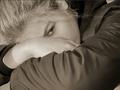
Restingby DufusComment: I gave two 10s in this challenge--this is one of them. A perfect shot as far as I'm concerned. Your subject is very pretty and you did everything to bring out her beauty even though much of her face is hidden by her arms. Your lighting is great, wonderful contrasts and sharpness of focus. The only thing I would even suggest is a tiny, almost insignificant change in tweaking the lighting just a tad to remove that shadow from her right arm. It's a tad bit distracting. Other than that, I think it's just a wonderful depiction of At Rest. Good luck. |
| Photographer found comment helpful. |
| 09/26/2003 04:06:51 PM |
Sweet Dreamsby SimplicityComment: This is my favorite of the challenge. The softness of the focus, the pastel blue shade, the peaceful, natural expression of a sleepiing child all combine to create a delicate work of art. I wouldn't change a thing. Good luck. |
| Photographer found comment helpful. |
| 09/26/2003 04:03:15 PM |
Neon babyby mweintrComment: This is interesting but doesn't do much for me personally. Being an attempt at artistic creativity, I guess it's more a matter of taste than anything I can actually suggest you change. I do think the black shadows, particularly on his (her?) face are too stark, drawning out most of the features that make a baby so beautiful. There is no debating whether this fits the challenge, because it obviously does. |
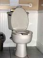
| 09/26/2003 03:47:14 PM |
The most restful place in the home...by mattsComment: You must be a guy--a woman would NEVER leave the seat up! LOL Anyway, you might be right about this being the most restful spot in the house, but to make it a challenge-worthy photo, it needs to be cleaned up and better lit to give it more appeal than just being a snapshot of a toilet. Your lighting gives it a less-than clean feel--not a very tasteful thought and I think your camera or resizing process distorted the lines, especially on the lid and around the chrome plumbing. I do like the hint of gold on the wall as well as the tissue box being the only color in the room. I nice attempt at humor, but could be better executed. |
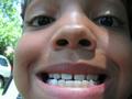
| 09/26/2003 03:41:13 PM |
THE SMILEby gatorb1955Comment: Despite not conveying the Rest theme to me, this picture is is somewhat lacking in appeal for me. The hard straight shadow on the right is distracting as are the automobiles in the background. It comes across as little more than a snapshot of a child mugging for the camera--appealing to a parent or someone close to the child, but to a wider audience, there is not much to look at here. |
| 09/26/2003 03:36:39 PM |
Wine in memoriumby arigirardijrComment: This just isn't a very interesting shot to me. Your lighting does little to enhance your subject and there is nothing about the placement on the page, the backdrop or the corks themselves that give me much reason to linger on the photo. I guess I can see your angle in fitting it within the theme of the challenge, but it doesn't quite work. |
| 09/26/2003 03:33:13 PM |
Mouse at rest in peaceby Ruud VermeijComment: I want to let you know that the low score I gave you on this was not because of the subject matter (although it does not at all appeal to me) but because your execution (uh...pun not intended. LOL) of the shot isn't very interesting. I think it might have come across a bit more artistic had you chosen black and white over color, since the teal of the ground is very uncomplimentary to the green of the foliage behind the cat. I like the DOF fine. |
Home -
Challenges -
Community -
League -
Photos -
Cameras -
Lenses -
Learn -
Help -
Terms of Use -
Privacy -
Top ^
DPChallenge, and website content and design, Copyright © 2001-2025 Challenging Technologies, LLC.
All digital photo copyrights belong to the photographers and may not be used without permission.
Current Server Time: 08/05/2025 11:28:16 PM EDT.