| Image |
Comment |
| 09/03/2006 01:19:11 AM |
Perfect Starby KelliComment: Ohh yes.. I see the perfect star.. haha.. :) 20 for this shot.. :) |
 Photographer found comment helpful. Photographer found comment helpful. |
| 09/03/2006 01:18:31 AM |
|
| Photographer found comment helpful. |
| 09/03/2006 01:15:08 AM |
Soft Shades of Yellowby KelliComment: Agree with Lev on this one.. I would try a portrait composition .. a 4x6 would be great.. leave out the white space.. tighter crop and more of the vase..
The colours is a little washed out.. try the curves and work it up a little..
Would have been a great stock shot.. did you try? hee hee.. :) |
| Photographer found comment helpful. |
| 09/03/2006 01:12:25 AM |
|
| Photographer found comment helpful. |
| 09/03/2006 01:11:04 AM |
|
| Photographer found comment helpful. |
| 09/03/2006 01:10:08 AM |
|
| Photographer found comment helpful. |
| 09/03/2006 01:08:23 AM |
Feeling Blueby KelliComment: Ouch.. I'll skip the lecture on this one (hee hee).. saw your comments on the wanting to enter a member's challenge.. I've learnt that if I don't have a really powerful photo, I'll skip the challenge..
Give it a really good crop.. may be a 6"x3" or even a 6"x2" ratio..
Removing the sky and the water which does not show off the colours..
next, post process to being out the colours..
You might get away with a higher standing.. :)
Hope this helps. |
| Photographer found comment helpful. |
| 09/03/2006 01:04:19 AM |
Love notes left behindby KelliComment: the idea is nice.. but makes the photo looks a little busy.. Sharper focus and more vibrant colours will improve the photo i felt.. |
| Photographer found comment helpful. |
| 09/03/2006 01:02:51 AM |
Stormy Riverby KelliComment: The lack of colours makes this an average shot.. that's why it's been voted down. Sandy made a point where if you've gotten the sun, it'll be perfect..
In this case, you might be able to do it in Black and White.. :)
Love the details on the water.. |
| Photographer found comment helpful. |
| 09/03/2006 01:00:50 AM |
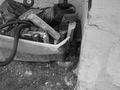
The broken stuff behind a broken home...by KelliComment: Hi Kelli...
Will start with the photos you've recieved the least comments on.. Here goes..
This would had been a great shot.. Try to give it a tighter crop taking away the blank space on right...
Focus seemed to be on the wall.. try to adjust the focus on the subject which are the broken stuffs.
You'll need to improve on the B/W post processing here..
Go daring on working the curves to give u a greater constrast...
Hope this helps.. |
| Photographer found comment helpful. |
Home -
Challenges -
Community -
League -
Photos -
Cameras -
Lenses -
Learn -
Help -
Terms of Use -
Privacy -
Top ^
DPChallenge, and website content and design, Copyright © 2001-2025 Challenging Technologies, LLC.
All digital photo copyrights belong to the photographers and may not be used without permission.
Current Server Time: 08/22/2025 05:36:11 AM EDT.