|
|
|
Showing 881 - 890 of ~1240 |
| Image |
Comment |
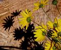
| 11/05/2003 01:15:35 AM | wildflowers & shadowsby katlynComment: *critique club*
I think that the earlier commentors have picked up on the main problems in this shot - the lack of clear focus on the flowers and the overall lack of sharpness.
I've looked at your profile and I really like your butterfly photos. You have brought out the colour there very well indeed. That fascination with colour is missing here. Also, the composition in your butterfly shots is interesting, with a nice placing of the main subjects. The composition here needs similar consideration, I feel.
Best wishes,
Jim
|  Photographer found comment helpful. Photographer found comment helpful. |
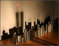
| 11/05/2003 01:09:20 AM | Queenby dwatersComment: *critique club*
Starting from you final score, I think that you'll realise that you got hammered for being considered off-topic. 'Shadows' and 'low key' have different meanings in photography. 'Low key' refers to a photo where the overall colour range is dark, like in your entry, sometimes created by shadow regions, sometimes not.
Leaving that aside, there is another reason why you got hammered in the voting - DPC tends not to favour challenging images, as yours is. By 'challenging', I mean images whose meaning is not immediately apparent, including abstracts, and images that are even slightly uncomfortable or grotesque.
Photographically, your intention could have been reinforced by reducing the clutter around the object, by making the ice-breath more obvious through a repositioning of the camera angle and by adding more light to the head area to clarify the object.
Best wishes,
Jim
|
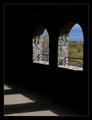
| 11/05/2003 12:59:26 AM | Autumn Castleby dg02Comment: *critique club*
You've certainly met the challenge - shadows do play an important part in creating the atmosphere here.
The overall darkness is nicely balanced by the bright blues and the outside scene. The bright floor area to the left and the bright outside area to the right maintain this comfortable balance.
Comfort is a key term. Apart from the single leaf (an oversight?), this is a traditional shot. You haven't taken any risks. Even the border smacks of conformity. This is not a bad thing - it places your intention squarely within a given convention.
The textures on the walls have been brought out nicely, as have the clouds and trees.
Overall, a nice shot, but not very awe-inspiring.
Best wishes,
Jim
| | Photographer found comment helpful. |
| 11/05/2003 12:50:18 AM | Naturally Beautifulby OneSweetSinComment: *critique club*
We meet again.
I like this shot, and I feel that if it were in a different challenge, it would have done much better. There is grace in the natural world, of course, but voters here tend to be much more literal than we suspect before entering a shot. To me, symetry is naturally graceful, and here you have 2 strong lines; the trees and their reflections.
I wonder about the composition, though. The main interest seems to be in the trees and in the water. The amount of sky seems to be too great. Either extend or contract the sky content to create more drama.
The colours are probably natural. 'Probably' because they don't appear washed out and look as they would in real life. It's very easy to increase saturation to give the impression of a better autumn colour, and indeed, many voters would have appreciated that more. Your maintainence of the natural order is understood.
The building is a contentious point, too. On the whole, I feel that it would have been better left out, but a part of me feels that it does add a sense of moderity to the shot. At the weekend, I took an almost exact version of this scene taking pains to include a building. My wife didn't like the building. Win some, lose some.
Of the shots I've critiqued, I think that this is the most effective one so far. Keep up the good work.
Best wishes,
Jim
| | Photographer found comment helpful. |
| 11/05/2003 12:40:44 AM | A Gathering of Dewby e301Comment: *critique club*
Greetings again. We seem to meet far more than statistically appropriate...
I agree entirely with Willem's comments below. In fact, I can't add much more to that. I can see a graceful line in the leaf itself, and the water droplets add a touch of beauty. However, overall, I feel that it's just a little dull.
Best wishes,
Jim
|
| 10/29/2003 01:56:48 AM | little starby imagesloyolaComment: This is a great shot. You've used the lighting so well that I'm simply overcome with wonder. This certainly goes into my favourites!
|
| 10/28/2003 12:06:04 AM | Shades of Autumn by moodvilleComment: I didn't vote in this challenge. If I had this one would have been up among my top scorers. It's a great shot. Lovely textures on the vase, and the colour range is warm and inviting - very Autumnesque. Congratulations on the well-deserved ribbon. | | Photographer found comment helpful. |
| 10/27/2003 01:09:56 AM | Shadows Of The Past by HomunculusComment: great idea here. very imaginative. the shadows to the front of the staples could have been used more effectively, though
|
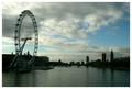
| 10/17/2003 10:27:24 PM | High Tide on the Thamesby e301Comment: =critique club=
Before starting, I'd just like to say that after quite a long break from doing this, I read a forum thread a few minutes back re-urging folks to continue producing critics - started by you! Then this photo comes up! Talk about co-incidence.
You seem to be contrasting the openness of the sky with that of the water as your two key elements. These work with the cityscape silhouettes and the challenge is met well. I don't know if you intended this, but I like the idea of the city/ man controlling the water but being dominated by the much greater force of the sky. Man has always tried to conquer the sky by building bigger, taller, wider building, by creating machines that challenge the dominance of the sky. In this photo, you've shown a new ferris wheel (?) extending right into the clouds, as if saying that this is man's latest attempt. This is a nice idea. A further irony is present in that the buildings on the right were, at one time, serious challengers in the contest 400 years ago.
In terms of colour, there's an overall feeling of darkness. Maybe you meant to protray London's bleakness, but, for me, the resulting image is not entirely pleasing. Possibly that's because the ferris wheel is backed by the darkest cloud mass (detracting from its presence somewhat), whereas the parlimentary buildings have a little more open space. Certainly the bright areas don't add to the composition in terms of placing, although they do in terms of shape.
A question about the silhouette: there are shades of grey and light discernable in them. I'm not sure whether or not you aimed for a true silhouette or simply underexposed the buildings. I feel that doing either 100% would have resulted in a stronger entry.
So, on the whole, I think that this is a good idea which could be usefully reworked. It scored over 6 in the challenge, but I would give only a 5. Sorry.
| | Photographer found comment helpful. |
| 10/13/2003 11:17:17 PM | | | Photographer found comment helpful. |
|
Showing 881 - 890 of ~1240 |
Home -
Challenges -
Community -
League -
Photos -
Cameras -
Lenses -
Learn -
Help -
Terms of Use -
Privacy -
Top ^
DPChallenge, and website content and design, Copyright © 2001-2025 Challenging Technologies, LLC.
All digital photo copyrights belong to the photographers and may not be used without permission.
Current Server Time: 08/11/2025 09:13:36 AM EDT.
|