|
|
|
Showing 871 - 880 of ~1240 |
| Image |
Comment |
| 11/14/2003 09:59:50 PM | A Clockwork Orange - by Anthony Burgessby drgsoellComment: Good idea. I like the texture on the black backing, although it could have been brought out more. Just one point, and this is purely subjective, as the book is a bit grim, if I remember rightly, wouldn't clock hands which don't look like a smile be more appropriate, or is the smile a part of your meaning? 8 |  Photographer found comment helpful. Photographer found comment helpful. |
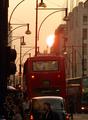
| 11/14/2003 12:20:36 PM | Sunset Boulevardby ImagineerComment: Images have meaning because of our interaction or our connection with them. I lived in London for 9 years and this image reflects my conneciton with that sharply. Thank you.
Graphically, well done.
| | Photographer found comment helpful. |
| 11/12/2003 01:40:26 AM | Queen's Gambitby Adrian TungComment: Adrian,
As a chess player, I know the risk in 2.c4. As a photographer who has taken lots of shots of chess pieces, I'm also aware of the problems of transposing chess (intellectual) tension into photography (visual) terms. We must rate each photograph purely on visual terms, unless we are sure of our audience completely.
Visually, (and I find this very difficult because I'm looking at the position from a chess player's perspective) the shot is okay. The dof produces a very blurred foreground, a sharp centre, but not the necessary blurred background required to balance.
The main lines are difficult to make out visually, and there seems to be an arbitary cropping. Lighting is good and it allows pawn d5 to pop. Unfortunately, d5is blocked somewhat, reducing its effect. Maybe a wider lighting would have produced more clarity on the squares.
I got hammered with my last chess shot, too. I don't think that people noticed the heart in the centre. Don't worry about your score. You made a good shot which most people found worthy. | | Photographer found comment helpful. |
| 11/12/2003 01:13:01 AM | Where is this way going to take me?by BBBastetComment: This is a nicely done, well composed, colourful shot. Not still life, but a good shot. Your low score reflects your interpretation to the challenge more than the quality of the shot. I like this one. |
| 11/12/2003 01:10:29 AM | Where Have All the Flowers Gone?by WildflowerJoyComment: I was very surprised to see that this shot came in at 4.4ish. It could use a bit more sharpness and, perhaps, a bit more colour saturation. But it is a fine shot and an interesting idea. | | Photographer found comment helpful. |
| 11/12/2003 12:55:58 AM | |
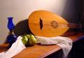
| 11/12/2003 12:49:19 AM | Still life with luteby SkiJumpNoseComment: We should get together sometime and bring our instruments to life, rather than have them stay still. Nice shot. 5.7 is a very respectable score, indeed. |
| 11/05/2003 03:55:25 AM | The Shadow Fairyby WILDBLUEComment: *critique club*
Hi, Renee,
Certainly, you've met the challenge head on. Just the slight intrusion of the vase (?) base on the right impedes a completely shadow-based photograph.
Compositionally, you've presented a strong line running from the lower right to the upper left. The close cropping works well. Indeed, photographically, this shot shows a great deal of control.
The shadow, unfortunately, isn't stable throughout its range. The upper left area is noticably weaker than the bottom right. There is a strange brightness halfway up the right-hand side, too. Besides these flaws, there is an imperfection, a cut in the paper?, a tear in the wallpaper? in the upper right quarter.
These problems are not that important. I feel that the main reason your score didn't get much above 5 was that it wasn't that special. You've got a good base idea. Perhaps you could use a different lighting setup to intensify the drama? Or juxtapose the queen with another object?
Best wishes,
Jim
| | Photographer found comment helpful. |
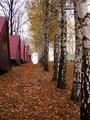
| 11/05/2003 03:46:17 AM | Walk In Shadowsby MonaComment: *critique club*
Hi, Mona,
You've got a nice, welcoming scene here. The colours are clear. I like the blues, especially. The greens and the browns could have a little more saturation to make them more vivid, although the colours you post here are probably very accurate.
The composition is pleasant, too. The path provides a nice leading line through the photo. The tree on the right and the lamp on the left provide a nice, natural border for the path.
In terms of this challenge, I don't think that you used shadows well enough to be the main feature of the photo. Certainly, there are shadows present, but they don't add or subtract from the shot. I think that this is the main reason why your shot scored so lowly at the end. It just didn't meet the challenge in most voters minds, I suppose.
Also, although it is lovely, it is rather dull. There's nothing of special interest here. You need to focus on just one aspect of the scene (for the challenge, I would have recommended the shadow) and find a composition and lighting combination that would have produced a more dramatic effect.
Best wishes,
Jim
| | Photographer found comment helpful. |
| 11/05/2003 02:54:49 AM | | | Photographer found comment helpful. |
|
Showing 871 - 880 of ~1240 |
Home -
Challenges -
Community -
League -
Photos -
Cameras -
Lenses -
Learn -
Help -
Terms of Use -
Privacy -
Top ^
DPChallenge, and website content and design, Copyright © 2001-2025 Challenging Technologies, LLC.
All digital photo copyrights belong to the photographers and may not be used without permission.
Current Server Time: 08/11/2025 08:37:02 AM EDT.
|