|
|
|
Showing 791 - 800 of ~1240 |
| Image |
Comment |
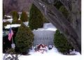
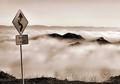
| 02/01/2004 11:25:01 PM | Vince Lombardi - Three Decades of Tributeby bjallenComment: **critique club**
Overall, I think that you're more aware of the problems in the shot that I am. The earlier commentors explained most of the problems.
Compositionally, I like the use of the natural frame, the tree on the right. Otherwise, you're right, the elements are a bit haphazardly arranged. The snow, also, didn't help as it covered up your point - the mementos after decades.
Which brings me to my point. From just the title and the photo, I had no idea what was going on. If DPC were just a north American site, maybe more people would know about this guy. The name and the memory mean a lot to those who know, and the photo's power and meaning increase accordingly. For those who don't know, we only have the visuals to go on.
The border worries me. Partly because I'm not so keen on two-sided borders anyway, but more importantly because of the snow at the bottom confusing my eye about a bottom border and the tree giving a natural border anyway. The left side border is actually not that bad - I'll have to rethink my position on 2-sided borders.
The colours are fine, although the snow is overexposed. A tone curve adjustment would have avoided this if the exposure were correct initially. That is expose to get the snow showing detail (reducing the overall brightness) and increase the brightness in the darker areas using the tone curve.
If you have any comments on my critique, please feel free to contact me.
Best wishes,
Jim
|
| 02/01/2004 11:14:23 PM | Bush Living 'tradition without technology'by camelotnorthComment: **critique club**
Hi, Betty,
Congratulations on a well-done photograph. You've captured a scene very nicely, and you've shown the warmth excellently.
Photography is about telling a story, and, here, you've shown the story of one woman's live. Perhaps this led to a very detailed shot, but then maybe that was necessary. For me, there's a bit too much detail for this photo to be comfortable. Filling the frame with just the woman and the action would be just as effective, I feel.
I believe that you met the challenge well. I had a double-take with the title, though. In this internet age, I read 'Bush' as the USA president's name at first. The pun on tribal bush tribes came later. I'd have preferred just the last part 'tradition without technology', as that is sufficient to tell your story.
On a different topic, I really liked your 'Mountain Man'. All of the business of the Dutch woman is gone, yet the story is just as full.
If you have any comments on my critique, please feel free to contact me.
Best wishes,
Jim
|  Photographer found comment helpful. Photographer found comment helpful. |
| 02/01/2004 11:03:43 PM | Lord and Masterby ImagineerComment: **critique club**
When I first saw this during voting, I thought, 'how English'. As a Scot, you can imagine what I felt.
Actually, as a photograph, I like it. It's well balanced, has a clear subject, shows the theme very directly and successfully, is exposed beautifully and is in sharp focus.
I have no problems with the composition. That the human is walking away is more appropriate to a generalised scene than the other way around. And that co-ordinates with the colour scheme - evening, coming home. Colours overdone? Not for me. Just fine and dandy.
I'm afraid that I'm not going to offer much in the way of constructive criticism this time. That's because any problems I have with this shot are my own problems, not with this shot. I'd have given a 7 had I voted. (Maybe some brightening on the dog's coat would have helped a bit. And not obscuring the head with the building might have cleared up some visual confusion.)
If you have any comments on this critique, please feel free to contact me.
Best wishes,
Jim
| | Photographer found comment helpful. |
| 02/01/2004 10:55:39 PM | Wild And Flirty Cat Population In Europeby MonaComment: **critique club**
You have the makings of a very good shot here. You've managed to fill the frame well - a basic consideration of good photography.
I think that the challenge has been met, although with some reservations. I'll come to those in a minute. You said that you aimed to be funny. Well, we have different senses of humour, so I won't comment on that.
Technically, I think that the whole is underexposed and a little soft. There isn't a (natually occuring) centre point. Did you manipulate the eye in post-processing? Perhaps you were aiming for a darker feeling due to the subject matter?
To bring out your subject and to make it fit the challenge, you really needed to expand on those other elements within the frame. Without the title, the meaning is lost. IMHO, titles are to enhance meaning, not create it. If this is a stray cat, then show me the surroundings, show me the dirt and squalor, show me what that bar at the top is (a part of a derelict building?), show me what that jumble at the right it (some barbed wire, lying waste?) Give the darkness a context - just being dark doesn't help me. If it's a hidey-hole, show that in relation to the outside world.
The eye. The really strange effect you made is unsettling. I know that you tried to show a wink and a glitter in the open eye. Sorry, I find the unnaturalness too unsettling for this joke to work on me.
There we have it. If you have any comments on my critique, please feel free to contact me. I've noticed that you didn't mark as helpful any comment which was negative. That's too bad. I fully agree with many of those comments, and I feel that they could actually help you improve this shot.
Best wishes,
Jim
| | Photographer found comment helpful. |
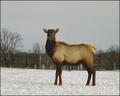
| 02/01/2004 10:43:25 PM | Mildred the Moose Passes Time on a Rural Michigan Farmby dirtkahunaComment: **Critique club**
This image suffers from a number of tiny flaws. You have the makings of a good image here, though. Post-shooting editing would help you a lot.
Firstly, let's consider the age-old advice about filling the frame. You have roughly 3 content areas: the sky, the snow and the animal. The sky is boring, so cut that out. Interest lies in the animal, mainly and in the snow. Cropping around the animal would help give this image more punch and help the viewer focus in on the subject. Kill the sky. Zooming right in would also help eliminate some of the distracting fences.
Next, we need to think about exposure. I don't know if you relied on the autoexposure in your camera or not, but I think here that the snow and the face are underexposed - both signs of automatic metering at work. Generally, you need to compensate up by 1.5 stops for snow. That would, incidentally, help the face, too. Personally, I would manually meter for the snow and the face and choose a reading which helped both, rather than rely on autometering.
Thirdly, focus. Although it's generally okay, there isn't any spot which jumps out at me. Using f8 was probably a result of trying to get the whole shot in with your camera's shutter capacity. I'd have used a ND filter, opened up the f-stop to it's widest, then focussed on the eyes.
The lack of a sharp focal points indicates another weakness here. Metaphorically, there isn't really a focal point, either. This is just an animal in a field. What's the animal feeling? doing? thinking? You need to find your point and develop your shot for that. The above points of exposure, composition and focus would all be pulled into a tight co-ordination once your subject point is organised.
Finally, a word about titles. I see from your profile that you're a musician writing music for your band. That's great. If you also write the lyrics, too, you'll understand that need for titles which are designed well. You might consider retitling your shot, too. I'd think about poetic rules, such as rhythm, assonance, alliteration and so on. (You've started with the 'M' theme, might that be made more meaningful?)
If you have any comments on this critique, please feel free to contact me.
Best wishes,
Jim
|
| 01/30/2004 02:30:16 AM | | | Photographer found comment helpful. |
| 01/30/2004 12:29:27 AM | | | Photographer found comment helpful. |
| 01/29/2004 12:37:56 AM | | | Photographer found comment helpful. |
| 01/28/2004 12:32:00 AM | Cloudy Corners by GringoComment: Congratulations on a well-deserved ribbon. A very, very emotive shot here. | | Photographer found comment helpful. |
| 01/27/2004 02:48:48 AM | Gatheringby pitsamanComment: Maybe it's the compression required for downloading, but I find the stem very plasticy. The colour version is really good. | | Photographer found comment helpful. |
|
Showing 791 - 800 of ~1240 |
Home -
Challenges -
Community -
League -
Photos -
Cameras -
Lenses -
Learn -
Help -
Terms of Use -
Privacy -
Top ^
DPChallenge, and website content and design, Copyright © 2001-2025 Challenging Technologies, LLC.
All digital photo copyrights belong to the photographers and may not be used without permission.
Current Server Time: 08/11/2025 05:51:08 PM EDT.
|