| Image |
Comment |
| 02/02/2004 12:40:18 AM |
Birds and Parksby qnjtComment: Nice idea. I'm troubled by the lack of focus on the birds and the choice of background. 4 |
 Photographer found comment helpful. Photographer found comment helpful. |
| 02/02/2004 12:39:12 AM |
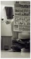
Sunday Morningby jimmyn4Comment: LOL. Overall, I really like this shot. Just the toe and the top of the paper being unsharp spoils it just a tad. Interesting camera angle and fine composition. 8 |
| Photographer found comment helpful. |
| 02/02/2004 12:36:44 AM |
Duetby whynotComment: I see 2 big bubbles. Other than that, I'm not very impressed with this shot. 2 |
| 02/02/2004 12:35:26 AM |
Party At Your Own Riskby kim100878Comment: Beer and beer food - a good combination. The composition is fine, but I feel that the overall sharpness is weak as is the lighting. 3 |
| Photographer found comment helpful. |
| 02/02/2004 12:34:04 AM |
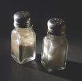
salt and pepperby slonkoComment: Sorry. The actual shooting is okay, but the size is too small, and the subject is a bit bland and obvious. 3 |
| Photographer found comment helpful. |
| 02/02/2004 12:31:56 AM |
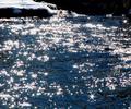
Sunlight on Waterby jmritzComment: Ouch. My eyes hurt!
Although I don't really like this shot, kudos for making a big impression. Compositionally, I'd like to see more of the snow at the top left. 6 |
| Photographer found comment helpful. |
| 02/02/2004 12:29:50 AM |
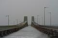
DUAL BRIDGESby TLL061Comment: Nicely arranged graphics here. 2 problems, the overall greyness - couldn't you have waited for a nicer day? the dullness of the sky depresses the shot, cropping was in order. 5 |
| Photographer found comment helpful. |
| 02/02/2004 12:27:59 AM |
|
| Photographer found comment helpful. |
| 02/02/2004 12:26:39 AM |
Hard Lives & Stories Untold.by jjbeguinComment: Very good photo. Lovely use of grain/ noise. Tonal range and textures very nicely done. It's a stretch to see how it fits the challenge, though. (Yes, I understand your title.) 7 |
| Photographer found comment helpful. |
| 02/02/2004 12:05:23 AM |
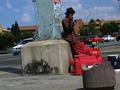
A street vendor takes a break under the midday sunby GinaRothfelsComment: **critique club**
Hi,
Okay, I'm going to go against the other commentors here and say that I think that the angle and the exposure actually make this photo a better one. Art is never meant to be pleasant: it's designed to make us think, make us uncomfortable, make us react to our environment more. Whether or not one believes that photography is art or not is a debateable point. In this case, you've introduced art into photojournalism. Well done.
The angle helps the meaning because it helps us feel a little of the unstability of the vendor. We're transported into his world, a world where the comforts of life are not taken for granted. The darkness in the face help, too, because there's a sense of anonymity, the feeling that the vendor is just another statistic.
However, just to counter the possibility that the exposure wasn't deliberate, and to find out how to appeal to DPC more, let me just add that you should expose for the face primarily. As the face is black, you need to compensate down a stop. If you find that the sky loses its colour, you'll need to use a polarising filter.
I find that the composition is a bit strange. I'd like for the vendor to be less centred because the cars behind the pillar on the left don't add anything to the scene, and there's a great possibility that there is valuable elements missed out on the right. Or zoom in more.
If you have any comments about my critique, please feel free to contact me.
Best wishes,
Jim
|
| Photographer found comment helpful. |
Home -
Challenges -
Community -
League -
Photos -
Cameras -
Lenses -
Learn -
Help -
Terms of Use -
Privacy -
Top ^
DPChallenge, and website content and design, Copyright © 2001-2025 Challenging Technologies, LLC.
All digital photo copyrights belong to the photographers and may not be used without permission.
Current Server Time: 08/12/2025 01:56:56 AM EDT.