| Image |
Comment |
| 05/17/2005 08:59:46 AM |
Nine O'Clock Shadowby mrmorrisComment: The black blob on the left detracts from this very appealing shot. I understand that you wanted to show the beginning of the branch and have the sun in the middle bottom, so you may have felt a bit constrained by that. For me, the real impact here is in the details in the buds. So, I'd have cut off the extreme right 1/8, got in a bit closer and asked a friend to pull the blob out of the frame. No friends? Well, you ARE a photographer. 7 |
 Photographer found comment helpful. Photographer found comment helpful. |
| 05/17/2005 08:56:12 AM |
Sunset Over Rydalby rexComment: I'd have cut the top 1/4 off. As is, the exact centring feels a bit too stable. I'm also left wondering how it would have been if the branches had been silhouetted against the sun a bit. That might have made the photo a bit more dynamic. 5 |
| Photographer found comment helpful. |
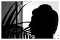
| 05/17/2005 08:52:14 AM |
Contemplationby ArtysteComment: There you are, and here I am screaming, "Stop thinking and get your finger on the shutter button!" The only problem I feel here is with the composition - the space above the head takes away from the strong line running from the head to the sun. A much tighter crop would really have brought that out. Otherwise a lovely shot. 7 |
| Photographer found comment helpful. |
| 05/17/2005 08:49:55 AM |
Meditation in the Cityby amberComment: Sorry, but I think that the ferns really take away from the integrity of the main subject's shape here. 3 |
| Photographer found comment helpful. |
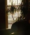
| 05/17/2005 08:49:02 AM |
my little cornerby buzzmomComment: While this is a nice scene, there's very little to grab my attention. It might have worked better if there'd been a pipe-smoking granddad reading a paper on the chair. That also might have helped avoid the glare. 3 |
| Photographer found comment helpful. |
| 05/17/2005 08:46:49 AM |
|
| 05/17/2005 08:45:25 AM |
Serenity at Sunsetby autoolComment: There's still too much detail in the face for a true silhouette. This, for me, is a touch frustrating as I can see a much better and much more appealing photo here if you lighten the face a lot. I suspect that you tried to force the challenge theme here. A potentially very, very nice photo for a different time. 4 |
| Photographer found comment helpful. |
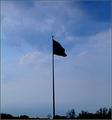
| 05/17/2005 08:41:53 AM |
Our Need To Communicateby SteveinnzComment: What a delightfully messy work. I'd cut off the bottom 1/5th, though for a tighter effect. I've been having my own troubles with electricity lines, so I'm happy to see them work so well in a photo. 7 |
| Photographer found comment helpful. |
| 05/17/2005 08:40:36 AM |
Rythm And Bass Is The Combination To Harmonyby tolovemoonComment: Besides not being a true silhouette, there's a fuzzy feeling here detracting from what should be a sharpness in the instruments' lines. About the title: try to avoid prepositions. Rhythm and Bass: Harmony's Combination might be more punchier. 3 |
| Photographer found comment helpful. |
| 05/17/2005 08:36:32 AM |
Practice, Patience, Perserveranceby NeuferlandComment: The double border isn't to my taste, and I feel that the black part is too thick. The action and composition are fine, and I like the colours in the bottom section. 5 |
| Photographer found comment helpful. |
Home -
Challenges -
Community -
League -
Photos -
Cameras -
Lenses -
Learn -
Help -
Terms of Use -
Privacy -
Top ^
DPChallenge, and website content and design, Copyright © 2001-2025 Challenging Technologies, LLC.
All digital photo copyrights belong to the photographers and may not be used without permission.
Current Server Time: 08/04/2025 09:38:10 AM EDT.