|
|
|
Showing 131 - 140 of ~1240 |
| Image |
Comment |
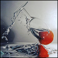
| 01/30/2006 08:07:49 AM | Escapeby OdieComment: Great bottom section! Absolutely crisp and vibrant. The dullness of the backdrop and the darkness on the left middle bring down the overall effect. 7 |  Photographer found comment helpful. Photographer found comment helpful. |
| 10/06/2005 05:05:28 AM | yokophotog.jpgby MAKComment: Way to go! Cute pic.
Our kids should meet up. Yours'll be like a big sister to mine. My little one's into cameras too, but she can't figure out how to look into the viewfinder yet. | | Photographer found comment helpful. |
| 10/04/2005 08:35:55 AM | Nina_0004_editby Judith PolakoffComment: I just love this photo! It's perfect in every way. The girl being cute helps, but the composition, the expression captured, the colours all work towards this magnificent photo. Good stuff. | | Photographer found comment helpful. |
| 10/01/2005 08:53:00 AM | | | Photographer found comment helpful. |
| 09/30/2005 10:49:57 AM | The Dressby idnicComment: For me, it's the little girl who makes this image come alive. Wonderful stuff. | | Photographer found comment helpful. |
| 09/30/2005 10:45:00 AM | Prisoner of Circumstance by typologicComment: Sorry for spoiling the party here, but having read the description of how the shot was made, I'm disappointed. For me (and this is important), DPC is about the single shot development, not using the computer as a backdrop and using multiple images.
I gave a 10 during the challenge thinking 'wow, the set up must have been fantastic'. Now, I still enjoy the photo on its own merits, but I would rather not see it winning.
I do think that your other stuff is really great and that you are truly a fantastic photographer. Message edited by author 2005-09-30 10:46:04. | | Photographer found comment helpful. |
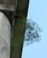
| 09/30/2005 12:54:33 AM | Tenacious Lifeby olddjComment: (I'm making an attempt to explain why I give any photo 3 or less. Obviously I won't like these photos, but DPC is a place to learn a) about what works in this environment and b) about what other individuals think. Please don't be despondant just because I don't like your shot. Rather than that, if your entry scored low, please try and understand one commentor's reasons.)
You have a nice idea here: showing how life will survive in the most unlikely places. However, sometimes good concepts don't turn into good visual images. The shrub is almost lost in the shade of the roof, taking away a lot of the visual impact of the shrub jutting out of the building. The sky is okay, but not special, meaning that a lot of the physical space is quite boring. Actually, the sky is a part of nature in a way that the building isn't. Yet, the building has more texture and is more interesting than nature. This goes against the intention of the photo. If you had waited until the sky was beautiful, your meaning would have been strengthened so much. | | Photographer found comment helpful. |
| 09/30/2005 12:50:31 AM | smileby deepwaterComment: (I'm making an attempt to explain why I give any photo 3 or less. Obviously I won't like these photos, but DPC is a place to learn a) about what works in this environment and b) about what other individuals think. Please don't be despondant just because I don't like your shot. Rather than that, if your entry scored low, please try and understand one commentor's reasons.)
These kids are cute, and their smiles are wonderful. I can see true expression here. One reason I gave a 3 was that the challenge asked for shots 'from the ground up', but this one seems to be from more or less the girls' shoulder height. Also, there's too much space around the kids. You needed to crop more. The higlights on the hair are too strong and there's a lack of contrast throughout making this photo feel like a snapshot. This is a cute family album type shot, but not that sucessful for a challenge entry. |
| 09/30/2005 12:47:51 AM | AHHH!!!!!!! no don't step on me (Ground's point of view)by Jamie2772Comment: (I'm making an attempt to explain why I give any photo 3 or less. Obviously I won't like these photos, but DPC is a place to learn a) about what works in this environment and b) about what other individuals think. Please don't be despondant just because I don't like your shot. Rather than that, if your entry scored low, please try and understand one commentor's reasons.)
Feeling charitable, I gave this a 2.
Okay, here I go: It's ugly, out of focus, has a hard flash reflection. Nice composition, though. I've been at DPC too long not to think that that you're deliberately going for the brown ribbon, but I'm not sure. |
| 09/30/2005 12:30:28 AM | End of Summerby shrewComment: (I'm making an attempt to explain why I give any photo 3 or less. Obviously I won't like these photos, but DPC is a place to learn a) about what works in this environment and b) about what other individuals think. Please don't be despondant just because I don't like your shot. Rather than that, if your entry scored low, please try and understand one commentor's reasons.)
Of all the 3s I gave out in this challenge, this one caused me the most grief. It's not that bad, really. The colours are vivid. The composition is dynamic and the challenge has been met head on. I scored low because the subject is so depressing and unwelcoming. I know that that's your point - the end of summer exemplified in flowers. But it turns me off. Also your fillflash worked well ont he top flowers but not on the bottom one, and it created a harsh shadow inside the structure. | | Photographer found comment helpful. |
|
Showing 131 - 140 of ~1240 |
Home -
Challenges -
Community -
League -
Photos -
Cameras -
Lenses -
Learn -
Help -
Terms of Use -
Privacy -
Top ^
DPChallenge, and website content and design, Copyright © 2001-2025 Challenging Technologies, LLC.
All digital photo copyrights belong to the photographers and may not be used without permission.
Current Server Time: 08/03/2025 11:57:29 PM EDT.
|