| Image |
Comment |
| 06/04/2003 02:31:02 AM |
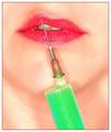
Liquid Beautyby kosmikkreeperComment: This one works for me - especially the upturned lip emphasising the sense of disgust at cosmetic surgery. However, the marks on the chin and the general fuzziness of the image bother me a little. |
 Photographer found comment helpful. Photographer found comment helpful. |
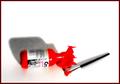
| 06/04/2003 02:26:36 AM |
|
| Photographer found comment helpful. |
| 06/04/2003 02:25:29 AM |
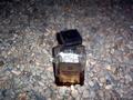
Amaretto on the...by qachykComment: It might have been funnier if the title didn't give away the punch-line. Good idea for a joke, photograph. |
| Photographer found comment helpful. |
| 06/04/2003 02:20:32 AM |
Martini Anyone?by URBANREMIXdotCOMComment: Good, strong colours, effective use of blur - you've tried to create the 'party' atmosphere. Having come this far, I miss the other party signs: more external details would have helped, I feel. Also, the hand seems too strong and rather detracts from the flavour somewhat. |
| 06/04/2003 02:18:25 AM |
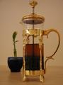
tea timeby apriceComment: I'm having trouble trying to work out the relationship between these two objects. OK, one is made from water and the other needs water to survive. But, beyond that, I can't see it. Even their shapes and colours don't inter-related enough to suggest meaning. Nice sharpness on the metal, though. |
| Photographer found comment helpful. |
| 06/04/2003 02:15:40 AM |
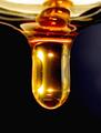
Honey dripping off a spoonby InnaNComment: If the top was completely sharp, this photo would be a winner for me. I think that you wanted to create motion, but the sharpness of the main shape is beautiful as is and would have made a great subject without the runny mess on top. OR, go for the runny mess as a subject. Both don't work together. |
| Photographer found comment helpful. |
| 06/04/2003 02:13:37 AM |
Limedby jpb56nyComment: Maybe it's because I'm lazy, but I have to work too hard here to get the point. The image isn't crisp enough to be classy. The lime isn't obvious enough to be the subject. The ice isn't sharp enough to be a strong element. I'm sorry, but this one doesn't work for me. |
| 06/04/2003 02:10:58 AM |
Paintby loz1Comment: I like the idea, but there's a confusion of intention - the grey shadow doesn't play well with both the space behind it and the red paint, one aspect would have been enough. Maybe a lower angle would have been more effective. |
| Photographer found comment helpful. |
| 06/04/2003 02:09:11 AM |
Go with the Flowby marinajoeComment: Good use of strong rhythms and contrast. The mirror image is effective, and the tilting is eye-catching. |
| 06/04/2003 02:07:54 AM |
liquid dreamsby grigrigirlComment: Nice idea. I'd like to see more of the sheet for the effect to be complete. The blurring on the face is a bit off-putting although I can see why that's intended. Anyway, who's dream? |
| Photographer found comment helpful. |
Home -
Challenges -
Community -
League -
Photos -
Cameras -
Lenses -
Learn -
Help -
Terms of Use -
Privacy -
Top ^
DPChallenge, and website content and design, Copyright © 2001-2025 Challenging Technologies, LLC.
All digital photo copyrights belong to the photographers and may not be used without permission.
Current Server Time: 08/04/2025 08:36:45 AM EDT.