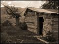
Home Sweet Home of Our Ancestorsby
pncowleyComment: Challenge Topic
Your photograph fits the challenge well. It envokes images of the past through the sepia tones and through the run-down look of the subject itself. There's an irony in the term 'sweet' home, as people back then lived much more roughly than we do.
Subject considerations
Pairing the old, worse-for-the-wear tree with a similarly run-down, man-made object works nicely. The rubble outside the shack adds to the feeling of decay, neglect. I wonder, though, if this supports the 'sweet home' mood, or is intended as a critical commentary on our neglect of the past. Either way, the subject powerfully incites our imagination. I would have prefered to see a window in the house. That would have helped the 'home' feeling. I suspect that you wanted the tree, the clouds and the shack, forcing a camera position without a window. The clouds, however, do not add much to the scene and could have been left out, especially as the adjustments needed to capture them left them looking slightly unnatural.
Technical considerations
A higher iso would have allowed you to capture the clouds better and the resulting grain would have aided the 'old-time' feel of the shot. Because of the darkness in certain areas, it's difficult to gauge the sharpness overall. However, I feel that there's no sharpness issue, at least on a computer screen. You may find problems when you print. The dof is well-chosen, each element is portrayed clearly.
The composition is good. Your subjects occupy the frame well, with no wastage. The lines of the shack lead smoothly to the tree, positioned slightly off-centre, whose branches lead us to the further reaches of the frame. The tree, to the top-right, helps crowd the frame and supports the homey feeling.
Overall strengths
You succeeded nicely in creating a particular feeling - that of an old-time environment. The colours, the subject, the location all support your idea well. There's a clear feeling of living in the wilderness, helped by the mountains, correctly sufficiently in focus.
Suggestions for improvement
The whole image might have been better lit, the darkness (I don't think deliberate, given your comments) is too strong. You might have included a window to strengthen the feeling of home. The attempt at including the clouds, I think, was the cause for the exposure problem and the resultant imbalance overall. I should explain that. Tonally, there's not as big a range between the lights and the darks as there could be in a b&w photo. Controlling that is, arguably, the foremost challenge of b&w photography. Without spot editing, digital camera users have it even more tough, and we really have to extend our vision of our instrument's range. An example - the brightest part of the non-sky scene is the closest part of the roofing. Graphically, this draws the eye towards that. A slightly longer exposure would have equalled the brightness in the front of the shack without losing any detail, and would have increased the overall tonal range significantly.