| Image |
Comment |
| 08/07/2003 12:27:13 PM |
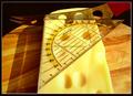
90 Degreesby Btrainx1Comment: idea is good, but background is distracting and another method of lighting, softer/more subtle, would have made this stronger. currently just looks like a snapshot. |
| 08/07/2003 12:23:08 PM |
|
| 08/07/2003 12:21:31 PM |
Pagesby frankensteinComment: good closeup. i like how you were able to catch the texture in the pages. |
 Photographer found comment helpful. Photographer found comment helpful. |
| 08/07/2003 12:20:21 PM |
|
| Photographer found comment helpful. |
| 08/07/2003 12:19:18 PM |
Booked Right Upby PhotobugComment: i think this would be stronger with more contrast. everything seems to be in the midtone range and blends together. |
| Photographer found comment helpful. |
| 08/07/2003 12:16:21 PM |
|
| Photographer found comment helpful. |
| 08/07/2003 12:08:19 PM |
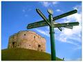
Which way to the castle?by BobsterLobsterComment: the contrast between the sign and person really gives a sense of how far away the castle is. my favorite thing about this is the little person on the bottom. hehe :o) |
| Photographer found comment helpful. |
| 08/07/2003 12:06:06 PM |
|
| Photographer found comment helpful. |
| 08/07/2003 12:03:07 PM |
Natural anglesby johnmkComment: the sun is really harsh, but i kind of like the effect. gives the image a magical feeling. |
| Photographer found comment helpful. |
| 08/07/2003 11:55:45 AM |
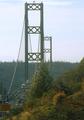
Bridge Towersby GeneralEComment: exposure is washed out. could use better focus and contrast. another possibility is to crop out all the landscape and just have the top of the bridge, perhaps stronger. |
| Photographer found comment helpful. |
Home -
Challenges -
Community -
League -
Photos -
Cameras -
Lenses -
Learn -
Help -
Terms of Use -
Privacy -
Top ^
DPChallenge, and website content and design, Copyright © 2001-2025 Challenging Technologies, LLC.
All digital photo copyrights belong to the photographers and may not be used without permission.
Current Server Time: 08/25/2025 05:57:49 PM EDT.