| Image |
Comment |
| 02/09/2008 04:30:03 PM |
|
| 02/09/2008 04:28:11 PM |
the shepherdby blgrComment: Like: Cool shot. Lighting and tone really match the subject and feeling you are trying to form. Composition is perfect.
Dislike: Little too much selective color saturation on the blue eyes, a more natural look since the photo looks "aged" would have been better.
7 |
| 02/09/2008 04:26:44 PM |
The world in my eyesby atvidComment: Like: Great color and lighting. Tight composition works for me.
dislike: a little sharper, not sure if its motion blur from camera operator or focus is off. |
| 02/09/2008 04:25:52 PM |
Eyes On The Prizeby OldCoyoteComment: Like: Well shot, i can only imagine how difficult it would be to photograph without anything in your way in that crowd.
Dislike: White haze, little blurry. But "eyes" dont really seem to be the subject of this shot. |
 Photographer found comment helpful. Photographer found comment helpful. |
| 02/09/2008 04:24:08 PM |
Nineczkaby pawdrixComment: Like: great shot, almost flawless in all aspects. Great idea for b/w conversion.
dislike: The dead space on the left is sorta of distracting. Since the model is looking at the camera, there is no need for leading room. So i would have put her a little bit more to the left, but still abiding by thirds.
nice shot.
8 |
| Photographer found comment helpful. |
| 02/09/2008 04:22:30 PM |
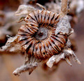
Eye???by GelertComment: Like: Unique idea, it does sorta look like an eye. Composition works. colors are good.
Dislike: its hard to tell if it is blurry just noisy. But there is a lot of noise. |
| 02/09/2008 04:21:04 PM |
|
| Photographer found comment helpful. |
| 02/09/2008 04:19:44 PM |
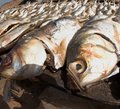
Fisheye Viewby Blink_Too_FastComment: Like: unique approach. eyes on the fish are noticable as the subject. Detail is good.
dislike: Blown out highlights and maybe have the angle so only the fish are viewed. (ie the dock on the top left is taken out)
7 |
| 02/09/2008 04:17:52 PM |
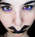
Grandma, what big eyes you’ve got!by bjoernComment: Like: Very fun idea. Composition is friendly and not bad. Eyes pop out well.
Dislikes: The mouth is distracting, as i see myself looking more at it then the eyes. Sharpness doesn't seem to have the full face, since you are doing a portriat style shot. |
| Photographer found comment helpful. |
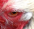
| 02/09/2008 04:16:16 PM |
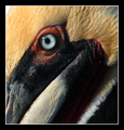
King Henry the Cockerelby TillyTigerComment: Like: Cool shot. Composition, and detail are great.
Dislike: Looks like it was heavily cropped for a digital zoom. There is some blown out highlights in the white.
7 |
| Photographer found comment helpful. |
Home -
Challenges -
Community -
League -
Photos -
Cameras -
Lenses -
Learn -
Help -
Terms of Use -
Privacy -
Top ^
DPChallenge, and website content and design, Copyright © 2001-2025 Challenging Technologies, LLC.
All digital photo copyrights belong to the photographers and may not be used without permission.
Current Server Time: 08/04/2025 03:42:42 PM EDT.