| Image |
Comment |
| 03/07/2008 09:02:48 AM |
|
| 03/07/2008 09:01:48 AM |
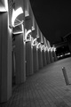
Lighted Brick Walkwayby WCpilotComment: Nice cropping but when you do a black and white photo i always think that you should add more contrast because grey is so boring (just a personal opinion)and the lights ae so bright compared to the grey it is a little distracting. I really like the picture though.. |
 Photographer found comment helpful. Photographer found comment helpful. |
| 03/07/2008 08:57:53 AM |
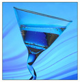
one too manyby margiemuComment: Beautiful color and nice use of smooth texture in the liquid and thick glass. With such a great glass it must be hard to take a bad picture. |
| Photographer found comment helpful. |
| 03/07/2008 08:55:56 AM |
Just Marriedby vladoComment: The fact that he's hanging on to the bar there gives a cool kind of superhero look. The detail on his coat was lost because of the lighting though, and your entire photo is in shadow which is also caused be the lighting. Maybe a different angle or time of day would have worked more in your favor. |
| Photographer found comment helpful. |
| 03/07/2008 08:53:18 AM |
Neglectby joynimComment: It is good you cropped out the horizon line it makes this picture look more natural, not just like you tilted your camera. The gate seems too bright though and i don't like how your subject is right in the middle. Moving oyu camera or getting at a diffent angle might have improved your image. |
| Photographer found comment helpful. |
| 03/06/2008 10:28:35 AM |
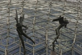
Geodesic Nymphsby randy999Comment: I don't really see the "tilted" part in here and the whole thing seems slightly blurry. |
| 03/06/2008 10:24:21 AM |
She's So Highby SureShotsComment: The border is distracting against the white and the whole photograph would be better if the whole thing was in blk & white the tiny bit of color on the snowborder is distracting. |
| Photographer found comment helpful. |
| 03/06/2008 10:12:24 AM |
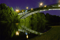
Beautiful Night by martinkulikComment: This is very dramatic and when tilted like this everything seems dreamlike and unreal. Really nice lighting and strong colors. |
| Photographer found comment helpful. |
| 03/06/2008 10:09:05 AM |
|
| Photographer found comment helpful. |
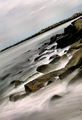
| 03/06/2008 10:03:29 AM |
Breakersby djhockmanComment: This is a very lovely picture and works really well because instead of looking like you just tilted your camera, this looks to me like a waterfall. Great range of values and movement. |
| Photographer found comment helpful. |
Home -
Challenges -
Community -
League -
Photos -
Cameras -
Lenses -
Learn -
Help -
Terms of Use -
Privacy -
Top ^
DPChallenge, and website content and design, Copyright © 2001-2025 Challenging Technologies, LLC.
All digital photo copyrights belong to the photographers and may not be used without permission.
Current Server Time: 08/23/2025 11:16:51 PM EDT.