| Image |
Comment |
| 01/10/2008 10:32:46 PM |
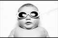
Superstar In Her Own Right!by trevytrevComment: Nice framing, nice high key lighting. Is the reflection in the glasses an umbrella light? Looks like starts or birds or something... it works. |
 Photographer found comment helpful. Photographer found comment helpful. |
| 01/10/2008 10:31:23 PM |
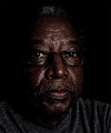
Knowledgeby signal2noiseComment: Ooh... love the texture in the skin and the low key lighting. Ideally I think I'd like just a little more whiteness in the eyes. Is the shirt oversharpened or is that just the shirt? The white dots in the shirt on one hand add to the texture but I think overall they distract from the face. |
| Photographer found comment helpful. |
| 01/10/2008 10:29:33 PM |
Meby DutchD70Comment: I really liked this one in the thumbnail but the larger image is a little blurry in the eyes. Nice close crop and off center framing. A little sharper and it would be a winner! |
| 01/10/2008 10:28:21 PM |
Bodyguardby bvlroComment: This ones different. I like how the hand frames the face and gives some motion and something different than just a face. I like the white background. Also like the funny look on the face. |
| Photographer found comment helpful. |
| 01/10/2008 10:27:23 PM |
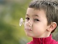
Hanging by a Noseby colorcarnivalComment: I love the lighting and blurred background. The skin looks so child-smooth, with an overall smooth yet sharp feeling (did you use a blur layer?). Nice! |
| Photographer found comment helpful. |
| 01/10/2008 10:25:56 PM |
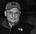
Steveby hkimageryComment: The face has character. I like that it's off center and simple colors. Background might be better out of focus. |
| 01/10/2008 10:24:42 PM |
|
| Photographer found comment helpful. |
| 01/10/2008 10:23:54 PM |
The Old Masterby DistantColoursComment: I like the detail in the face and the contrasting colors of the shirts with the bright background. Face is well exposed even though the background is white. I'm no expert but it seems like it might be slightly over sharpened. |
| Photographer found comment helpful. |
| 01/10/2008 10:21:57 PM |
Miss Cheviousby LonzComment: I like the lighting and neutral background-- the lighting seems inviting. The while blurred lamp in the background is nice too. Playful pose. |
| Photographer found comment helpful. |
| 01/10/2008 10:20:40 PM |
Dr. Jby quiet_observationComment: Interesting subject. B&W works well. Lightin looks to be straight on flash which is a little boring with harsh shadows on the face. |
Home -
Challenges -
Community -
League -
Photos -
Cameras -
Lenses -
Learn -
Help -
Terms of Use -
Privacy -
Top ^
DPChallenge, and website content and design, Copyright © 2001-2025 Challenging Technologies, LLC.
All digital photo copyrights belong to the photographers and may not be used without permission.
Current Server Time: 08/01/2025 01:53:42 AM EDT.