| Image |
Comment |
| 06/12/2003 01:43:05 PM |
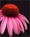
Garden Designby DennisFComment: Gorgeous......the crop is a little cramped maybe.....a bit more of the bg at the top might add to the image impact.....sides and bottom just right. |
 Photographer found comment helpful. Photographer found comment helpful. |
| 06/12/2003 01:27:54 PM |
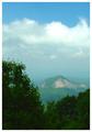
Our State -- North Carolinaby karmatComment: This would make me want to visit NC....bit sharper detail might give more impact to the image or perhaps more brilliance in the colour..... |
| Photographer found comment helpful. |
| 06/12/2003 01:22:09 PM |
BabyTalkby jdavisComment: There must be a really proud parent out there. Nice composition....colours just right for the subject...focus could be sharper. |
| Photographer found comment helpful. |
| 06/12/2003 01:16:02 PM |
American Babyby fjComment: Great composition.....the colour somehow doesn't seem to fit the image though. |
| 06/12/2003 01:09:05 PM |
Reptilesby Krawf47Comment: Isn't he lovely....like the composition, use of colour and texture but not the soft focus....this subject asks for a bit more tension, a bit more punch as though he is going to strike any moment. |
| Photographer found comment helpful. |
| 06/12/2003 01:02:39 PM |
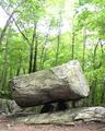
Geotimesby MarkS224Comment: Nice idea....lovely rock....but the lose of detail in the top of the trees detracts from the whole. |
| Photographer found comment helpful. |
| 06/12/2003 09:07:33 AM |
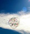
Bubble Liquidby LizzComment: Thanks for all the encouraging comments and good advice, it does a first timer a lot of good.....thank you people.
The graininess, lens flash and sunflare where all positive choices...I liked the way the colours of the bubble where mirrored by the colour of the graininess in the sky...I liked the strong diagonal that, together with highlight on the top right of bubble, the flash and flare created...I felt it led the eye in and out of the picture and added a sense of movement to the bubble...the lack of sharp focus on the bubble was because I don't no what the hell I'm doing..........ooooh a bit of self-justification does you good! |
| 06/12/2003 08:29:41 AM |
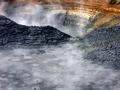
Bubbling Mud Potsby BAMartinComment: I love the colour.....I like the composition.....the way the various diagonals lead the eye into the deep 'mud pot' is very effective.
Regretably 'cause of time constrains (hopeless organisation actually) I didn't get to your pic when I was voting....I'd given it 9 at least. |
| Photographer found comment helpful. |
| 06/11/2003 05:07:14 PM |
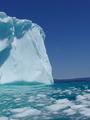
Photo Lifeby blaneComment: I really like the composition.... the colour is fabulous....the overly white highlights on the ice in the sea and the black dashes on the top left of the iceberg disrupt the visual flow. I wanted it to be my perfect 10 :-( |
| 06/08/2003 04:04:35 PM |
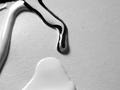
Wet Paint.by macoxComment: I like the idea....but composition I find a bit awkward....maybe flip 90 left or right or tighter crop around paint dribbles....could be a bit sharper - more dramatic b&w. |
| Photographer found comment helpful. |
Home -
Challenges -
Community -
League -
Photos -
Cameras -
Lenses -
Learn -
Help -
Terms of Use -
Privacy -
Top ^
DPChallenge, and website content and design, Copyright © 2001-2025 Challenging Technologies, LLC.
All digital photo copyrights belong to the photographers and may not be used without permission.
Current Server Time: 08/03/2025 06:58:13 AM EDT.