| Image |
Comment |
| 10/13/2003 12:26:51 AM |
|
 Photographer found comment helpful. Photographer found comment helpful. |
| 10/13/2003 12:25:32 AM |
Over-exposedby TrinchComment: nice composition and good idea, but the printing on the film roll is not very sharp. |
| Photographer found comment helpful. |
| 10/13/2003 12:18:07 AM |
|
| Photographer found comment helpful. |
| 10/12/2003 11:57:36 PM |
|
| Photographer found comment helpful. |
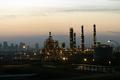
| 10/12/2003 11:56:34 PM |
Urban Refinery Rowby C-FoxComment: I like the strong lighting on the foreground buildings and the subtler lights on the ones in the distance. I would have cropped out the pipes at the bottom and the streetlight on the right. The horizon looks crooked as well. |
| Photographer found comment helpful. |
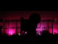
| 10/12/2003 11:54:02 PM |
Crazy Rock !by helgiComment: I like the lighting color, but the siloutted object is too unrecognizable |
| 10/12/2003 11:49:56 PM |
|
| Photographer found comment helpful. |
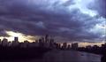
| 10/12/2003 11:49:13 PM |
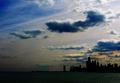
chicagoby tomzinhoComment: a nice sillouette with a dramatic sky, but the city profile looks artifically dark. |
| Photographer found comment helpful. |
| 10/12/2003 11:46:52 PM |
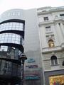
Old meets newby eliashanComment: I like the juxtaposition you are showing, but I would have cropped out the logos and streetlight at the bottom. Then you could have also removed some of the featureless sky and had the striking contrast you are conceptualizing. |
| 10/12/2003 11:45:18 PM |
Reflecting Chapelby OneSweetSinComment: I think this would have been a more effective shot had you cropped more off the bottom. I realize you liked the reflection of the chapel, but there is too much uninteresting foreground in the image. |
Home -
Challenges -
Community -
League -
Photos -
Cameras -
Lenses -
Learn -
Help -
Terms of Use -
Privacy -
Top ^
DPChallenge, and website content and design, Copyright © 2001-2025 Challenging Technologies, LLC.
All digital photo copyrights belong to the photographers and may not be used without permission.
Current Server Time: 08/04/2025 08:09:45 PM EDT.