| Image |
Comment |
| 02/02/2004 09:51:48 AM |
|
 Photographer found comment helpful. Photographer found comment helpful. |
| 02/02/2004 09:50:58 AM |
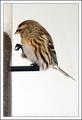
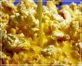
Bird and Seedsby JackoComment: I like this image, but I would have preferred to see you position the bird lower in the frame, making better use of the whitespace around and above it. |
| Photographer found comment helpful. |
| 02/02/2004 09:49:55 AM |
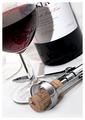
Wine & Corkscrewby jonpinkComment: Your exposure is very good. I like the composition, but not the angle. I think I understand the look and feel you were going for, but liguids presented at an angle like this look unnatural, like it will slide off the frame at any moment. |
| 02/02/2004 09:47:46 AM |
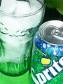
Soda & Iceby katlynComment: I think there might have been a more visually interesting way to show the relationship between soda and ice, perhaps with the beverage pouring over the ice. As it is, it is pretty static. |
| Photographer found comment helpful. |
| 02/02/2004 09:45:49 AM |
|
| 02/02/2004 09:45:19 AM |
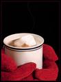
Titanicby sherComment: nice use of color and negative space. I don't know of the steam swirl was digitally added, but it looks good. |
| Photographer found comment helpful. |
| 02/02/2004 09:44:30 AM |
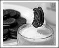
Milk and Cookiesby RHoldenSrComment: I'll be interested in reading how you set up the shot to have the cookie floating like this. |
| Photographer found comment helpful. |
| 02/02/2004 09:38:18 AM |
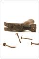
Futilityby welcherComment: clever take - "things that don't go together". I like the composition except for the out of frame screw. it would have been more visually interesting if it crossed the frame boundary but you could still see the whole thing. as it is, it just looks awkwardly cut off. |
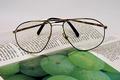
| 02/02/2004 09:36:43 AM |
Reading glassesby sn4psh07Comment: nice and sharp, but I think the illustration in the foreground detracts from the glasses. |
| Photographer found comment helpful. |
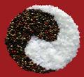
| 02/02/2004 09:32:37 AM |
Salt and Pepperby sfaliceComment: I like the closeup detail in this shot, as compared with the several other entries that attempted the same thing. The rock salt gives nice textural contrast to the whole peppercorns. I don't like the background though. I don't know if you masked it out but it looks very unnatual to me. I would have preferred a more appropriate setting for the subject and natural shadows. |
| Photographer found comment helpful. |
Home -
Challenges -
Community -
League -
Photos -
Cameras -
Lenses -
Learn -
Help -
Terms of Use -
Privacy -
Top ^
DPChallenge, and website content and design, Copyright © 2001-2025 Challenging Technologies, LLC.
All digital photo copyrights belong to the photographers and may not be used without permission.
Current Server Time: 08/06/2025 06:11:11 PM EDT.