| Image |
Comment |
| 06/20/2003 09:47:42 AM |
|
 Photographer found comment helpful. Photographer found comment helpful. |
| 06/20/2003 09:42:21 AM |
Loudby pitsamanComment: Stunning picture, but not low-key. 6 |
| Photographer found comment helpful. |
| 06/20/2003 09:38:35 AM |
Plastic Surgeryby DrJOnesComment: Wow, what a figure! Emma Peel in bondage...(!)
I feel that you missed the opportunity to explore the moodiness and darkness that a low-key image could have produced, IMO there are too many highlights, and not enough exploration of the darker tones. The glares don't work for me here. Other than that, very arresting photo! 8 |
| Photographer found comment helpful. |
| 06/20/2003 09:35:15 AM |
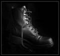
Tread Darklyby moodvilleComment: Great subject for challenge. Shame about the graininess, too many highlights on the boot for my taste. Otherwise, effective mood. 8 |
| Photographer found comment helpful. |
| 06/20/2003 09:33:35 AM |
Back In Blackby sherComment: Haha, this is how I kept seeing those words... I think you may even have an SG there (albeit a copy)!
Great concept, nice mood, good textures. Like the sharpness of the 'Marshall' logo. Graininess of guitar works well. Like the cropping, and angle of guitar.
My favourite pic this challenge, you met the challenge well. 9 |
| Photographer found comment helpful. |
| 06/17/2003 08:16:46 AM |
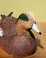
Wildfowl Carving Magazineby camelotnorthComment: Mediocre lighting, don't like the shadow. Not very saturated. Don't like the cropping, would like to see more of the left hand side of the photo. I don't think the table was a good choice of base... the wood grain doesn't do anything to help your main subject. However, there's a certain character to this I like. 6 |
| Photographer found comment helpful. |
| 06/17/2003 08:12:33 AM |
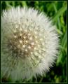
The Gardenerby JonatanComment: Aw, that's much better than any picture of a dandelion I've ever taken! Nice contrast between the white and the green background. Nice dof. Not sure i'd see it on the front of any magazine about gardening though. 7 |
| Photographer found comment helpful. |
| 06/17/2003 08:10:11 AM |
PC Worldby SappyComment: What on earth is that thing? Intesting use of light, a bit of glare in places though. Composition a bit cluttered for my taste. 7 |
| 06/17/2003 08:08:07 AM |
Practical Photographyby dasserComment: Brilliant, great textures and composition. Good concept. Really nice skin tones. Only thing that spoils it are the eyes... the reflection of the wood in her left eye cuts across her pupil, lessening the impact of the photo. 9 |
| Photographer found comment helpful. |
| 06/17/2003 08:06:02 AM |
Outdoor Photographerby progersctComment: Wonderful photo... love the female silhouette. Her hair works especially well. Not sure about the placement of the sun just off-centre here. Dead-on centre or to one side would have worked better for me. The ducks are a little distracting as well. Love the foreground leaves. 9 |
| Photographer found comment helpful. |
Home -
Challenges -
Community -
League -
Photos -
Cameras -
Lenses -
Learn -
Help -
Terms of Use -
Privacy -
Top ^
DPChallenge, and website content and design, Copyright © 2001-2025 Challenging Technologies, LLC.
All digital photo copyrights belong to the photographers and may not be used without permission.
Current Server Time: 06/21/2025 03:49:39 AM EDT.