| Image |
Comment |
| 06/30/2003 08:28:28 AM |
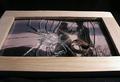
B is for Barbers in Black and whiteby EddyGComment: Inspired by 'the Man Who Wasn't There'? The boy's expression is what makes this picture for me. There is too much going on in the picture though for the composition to really hang together. Too much clutter... perhaps by stepping left you could have cut out a lot of the sistracting elements, and have had the chairs lined up. The eye just doesn't know where to focus. Great character shot though. Perhaps a little more sharpness could have helped as well. 6 |
 Photographer found comment helpful. Photographer found comment helpful. |
| 06/30/2003 08:13:19 AM |
B is for Butterflyby agwrightComment: This could have scored so much more from me without that terrible border. I can't tell you how much it spoils your photo by distracting the eye. Stop it! Perhaps a little less dof to blur the leaves a little more would have helped. 8 |
| Photographer found comment helpful. |
| 06/30/2003 08:10:30 AM |
Battle for the Ball by arnitComment: Superb action shot, but needs the title to make it fit the challenge. My first thought would have been 'football' rather than 'ball'. The dof is spot on. 8 |
| Photographer found comment helpful. |
| 06/30/2003 08:08:56 AM |
Broken Heartsby kengurinnComment: Very poignant shot. Such a great concept. But... it's a huge shame it wasn't carried off better... the glare on the frame detracts, the lighting in general seems a bit harsh. It looks like only one near light source was used, which casts unappealing shadows. I'd have liked to see the whole frame included, and a better background used. The current background accentuates the noise caused by shooting in low light. Perhaps if the photo was slightly rotated as well, to imply that it had been thrown down, rather than placed by a photographer. |
| Photographer found comment helpful. |
| 06/30/2003 08:02:38 AM |
'Blue-B'uttonsby justineComment: I like this shot, some may disagree but I think the dof works well here. I dislike the border which I feel detracts from the simplicity of the image, a black one would have been better. 8 |
| Photographer found comment helpful. |
| 06/30/2003 08:01:08 AM |
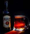
Beer!by pinbackComment: Nice concept... I like the choice of brand of beer... spiritual salvation faciitated through Abbot Ale. The backlighting works very well. I'd have liked the writing on the bottle to be a little more sharp. 8 |
| Photographer found comment helpful. |
| 06/30/2003 07:59:12 AM |
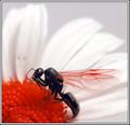
Bug and Bloomby JackoComment: Great shot! Love the wings, and the way the red complements the red in the flower. I'd have liked just a little more dof. Petals are very effective. 9 |
| Photographer found comment helpful. |
| 06/30/2003 07:57:53 AM |
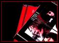
'Speaking Words... of Wisdom"by tfarrell23Comment: Amusing! Is this connected with the forum thread about the Sesame Street song by any chance?! The slight blur seems to help the concept here, but I'm not sure if it was deliberate. 9 |
| Photographer found comment helpful. |
| 06/30/2003 07:56:22 AM |
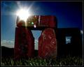
Brickhengeby dsidwellComment: Very silly, but I really like this one. Good control of exposure, the sun flare is very effective. Great textures. Shame about the noise in the sky where (presumably) you've pushed the saturation and reduced levels. 9 |
| Photographer found comment helpful. |
| 06/30/2003 07:54:38 AM |
|
| Photographer found comment helpful. |
Home -
Challenges -
Community -
League -
Photos -
Cameras -
Lenses -
Learn -
Help -
Terms of Use -
Privacy -
Top ^
DPChallenge, and website content and design, Copyright © 2001-2025 Challenging Technologies, LLC.
All digital photo copyrights belong to the photographers and may not be used without permission.
Current Server Time: 06/21/2025 04:31:26 PM EDT.