| Image |
Comment |
| 07/16/2003 08:55:28 AM |
A Round Perspectiveby ScottKComment: Ah, the view is from the top! Intriguing shot, very effective. Great turquoise colour. Nice composition. Effective lighting. 8 |
 Photographer found comment helpful. Photographer found comment helpful. |
| 07/16/2003 08:52:42 AM |
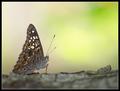
Camouflageby GordonComment: Superb photo, but I'm not sure how this is an exploration of 'roundness'. Background is particularly effective. 5 |
| Photographer found comment helpful. |
| 07/16/2003 08:48:56 AM |
Round'n'Roundby justineComment: Wow, I really like the blur on this one. Dof is great, very nice feel. I don't like the composition though, I would have prefered the subject at the bottom with plenty of empty space at the top. Great colours and saturation. 7 |
| Photographer found comment helpful. |
| 07/16/2003 08:46:43 AM |
Be gentle -- first subby sn4psh07Comment: Interesting shot, a bit too centred for my taste. Bit too much glare on the spokes of the wheel. Nice shot other than that, keep submitting! 6 |
| Photographer found comment helpful. |
| 07/16/2003 08:45:23 AM |
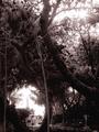
The Light Houseby swaroskjiComment: Noisy is an understatement for this picture. Has it been oversharpened? The texture of the trees is very disturbing. Nice light though, well exposed. Doesn't really explore 'roundness' for me. 6 |
| Photographer found comment helpful. |
| 07/16/2003 08:43:13 AM |
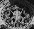
'Round and 'Roundby RiderGalComment: I don't care for the shadow in the upper right. Which is a shame, as I love this picture. Nice architectural detail. Works well in black and white. 7 |
| Photographer found comment helpful. |
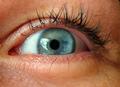
| 07/16/2003 08:41:59 AM |
I On Uby siggithorComment: The eye apperars to be out of focus. Not very flattering light. The gunk on one of the eyelashes doesn't help. Too much glare on the eye. 4 |
| Photographer found comment helpful. |
| 07/16/2003 08:34:01 AM |
|
| Photographer found comment helpful. |
| 07/16/2003 08:31:56 AM |
Golden Circleby sjonniComment: Terrible border. Although the sun is round, I feel that the photo doesn't really explore 'roundness'. Not crazy about the composition of the various hills. Everything seems to be at a slight slope... your foreground, the general horizon, the clouds... it makes me feel a bit dizzy. 6 |
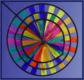
| 07/16/2003 08:26:14 AM |
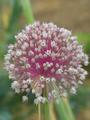
Color Wheelby GolferDDSComment: Your picture is only 100k and has visible JPEG artifacting... try to get as near to 150k as you can for the next one! Great colours, your border is very effective. I like your idea of having the stem(?) leaving the picture at the top left diagonal. Great textures. Maybe a bit too centred and simple for repeated viewing. 8 |
Home -
Challenges -
Community -
League -
Photos -
Cameras -
Lenses -
Learn -
Help -
Terms of Use -
Privacy -
Top ^
DPChallenge, and website content and design, Copyright © 2001-2025 Challenging Technologies, LLC.
All digital photo copyrights belong to the photographers and may not be used without permission.
Current Server Time: 06/23/2025 06:01:14 AM EDT.