| Image |
Comment |
| 07/02/2003 01:19:20 PM |
Lotion up!by taylorbehneComment: There's a difference between 'motion blur in part of a shot to show speed' and 'entire picture blurry,' I'm afraid. Her face, in particular, is disturbingly not-quite-in-focus. |
| 07/02/2003 01:18:40 PM |
TraFFic JaMby AntithesisComment: Doesn't look very speedy to me, I'm afraid. IMHO, YMMV, etc. It just doesn't work for me for this challenge. |
| 07/02/2003 01:17:59 PM |
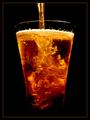
Fast Foodby laurenrhaeComment: Looks like a motion blur for a motion blur's sake, and also murky (as if it were at the bottom of a bottle of chlorine gas). Sorry, just doesn't work for me. |
 Photographer found comment helpful. Photographer found comment helpful. |
| 07/02/2003 01:17:19 PM |
High Speed Standoffby kblmComment: If this were a little crisper/less grainy, this could well be a 9 from me. Unfortunately, as it is, it's like looking at it through dirty glass. :-/ 6. |
| 07/02/2003 10:41:01 AM |
Another Cold Oneby millerComment: The play of light in this takes my breath away, and the first glance brings out the connection with the topic immediately (to me, anyway). The lighting is so damn amazing. If I have to find SOMETHING critical to say, I would add that I don't see what the border brings to it (just letting the edge end blackly would work as well, to me). :-> 10. |
| Photographer found comment helpful. |
| 07/02/2003 10:35:43 AM |
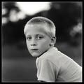
Baby Brotherby greenem2Comment: I love this image as a portrait, and as 'portrait' or 'kids' or 'direct gaze' or some such topic, it could get a 9 or 10 from me. However, the topic isn't blatantly obvious as you look at it (other than 'boy', I suppose), without the title's explanation, so that detracts from it a bit for me in this competition (YMMV, IMHO, pant pant). 6. |
| Photographer found comment helpful. |
| 07/02/2003 10:34:27 AM |
B is for Barbers in Black and whiteby EddyGComment: Hmm. There's a kind of busy-ness in the similarity of mid-grey tones - perhaps a slightly different angle when shot could have gotten the barbers against the mirror, or just one barber with a less muddled background or surroundings to distract the eye from where you want it to go? 5 (fits topic well enough, no glaring technical flaws, but not eye-catchingly appealing either). |
| Photographer found comment helpful. |
| 07/02/2003 10:32:44 AM |
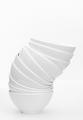
Bowlsby FranziskaLangComment: Finally, a *good* use of high-key! Man. I get kind of frustrated with people washing out their shots and trying to be stylish. This is a use I approve of, however. Makes a gorgeous abstract out of something that clearly fits the topic on first glance (title unneeded to explain). 10. |
| Photographer found comment helpful. |
| 07/02/2003 10:30:05 AM |
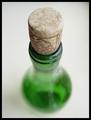
Bottleby SixtyfourComment: Well, technically, you made the *cork* the center and main focus of the image, but. :-> 7, |
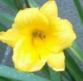
| 07/02/2003 10:29:05 AM |
Bloom in the rainby Crafty SueComment: This is rather unfortunately fuzzy-and-grainy. Maybe a slightly smaller image size (or less jpg compression?) could have turned it from 'flawed' to 'meeting the challenge but unobjectionable technically' - which to me is the difference between 4 and 5. |
| Photographer found comment helpful. |
Home -
Challenges -
Community -
League -
Photos -
Cameras -
Lenses -
Learn -
Help -
Terms of Use -
Privacy -
Top ^
DPChallenge, and website content and design, Copyright © 2001-2025 Challenging Technologies, LLC.
All digital photo copyrights belong to the photographers and may not be used without permission.
Current Server Time: 06/16/2025 10:32:50 PM EDT.