| Image |
Comment |
| 05/14/2003 10:41:36 AM |
|
 Photographer found comment helpful. Photographer found comment helpful. |
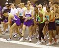
| 05/14/2003 10:41:24 AM |
The Raceby GolferDDSComment: Usually I find the 'crowd shots' people submit aren't very interesting, but yours stands out from the, you should forgive the expression, crowd. Good focus, good lighting, *and* there's actually some kind of composition/eye-pulling focus. |
| Photographer found comment helpful. |
| 05/14/2003 10:40:18 AM |
|
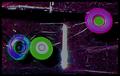
| 05/14/2003 10:37:34 AM |
beybladingby zanedogComment: This looks horribly overprocessed. The solarization really doesn't add anything, imho, it's just distracting (and kind of ugly). |
| 05/14/2003 10:36:38 AM |
|
| Photographer found comment helpful. |
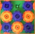
| 05/12/2003 05:42:42 PM |
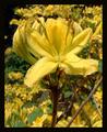
Primarily Peppersby kirbicComment: Did you paint the blue one? :-> That's a really neat image, great contrast, great sharpness, nice movement of the color from dark to sunny gold. |
| Photographer found comment helpful. |
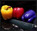
| 05/12/2003 04:44:34 PM |
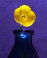
Primary Glass by JackoComment: Wow. Oh, wow. Luminous color, light that's almost painted on, crisp, clear, perfectly proportioned ... a ten. Definitely a ten, from me, anyhow. :-> Great shot, beautiful shot, and moreover it puts the challenge topic front and center in the starring role. |
| Photographer found comment helpful. |
| 05/12/2003 01:33:22 PM |
Yellow and Blueby scrooslooseComment: I really like how the background looks blotchy or almost pixelated and yet the flower and bottle are crystal clear. Good colors, good contrast, nice lighting. A studio shot, obviously. :-> |
| 05/12/2003 01:25:39 PM |
Yellowby tragicharpyComment: Nice color, nice light, nice focus. I could have graded it a little higher if there were more contrast in it - when I sit back and squint slightly I see a morass of almost all exactly the same shade of yellow (which, while an accomplishment of sorts, doesn't add to the visual interest much). 7 ... but might have been 8 or 9. |
| Photographer found comment helpful. |
| 05/12/2003 01:23:13 PM |
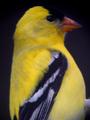
Goldfinchby SwashbucklerComment: This is almost great. I know it was a difficult shot, but just a little bit crisper, more in focus, and I could have given it two more points. It's just blurry enough to make me feel I have to adjust my glasses (though of course that wouldn't help). If it was a far/shaky shot, you could have gotten some sharpness by losing a little size, and improved the image immeasurably. |
| Photographer found comment helpful. |
Home -
Challenges -
Community -
League -
Photos -
Cameras -
Lenses -
Learn -
Help -
Terms of Use -
Privacy -
Top ^
DPChallenge, and website content and design, Copyright © 2001-2025 Challenging Technologies, LLC.
All digital photo copyrights belong to the photographers and may not be used without permission.
Current Server Time: 06/20/2025 01:55:01 AM EDT.