| Image |
Comment |
| 08/25/2008 01:58:39 AM |
|
 Photographer found comment helpful. Photographer found comment helpful. |
| 08/25/2008 01:57:32 AM |
Heading for homeby Gordon_1Comment: The contrast seems a little flat. Instead of getting all of the riders in the shot, maybe get just a few and blow up your frame size. |
| Photographer found comment helpful. |
| 08/25/2008 01:54:49 AM |
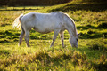
Simply Grazingby jegerComment: I like how the sun is backlighting her - especially the mane. The only thing I can think of to make it better is possibly cropping tighter to remove the foreground weeds/grass. |
| Photographer found comment helpful. |
| 08/25/2008 01:52:46 AM |
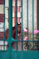
Il prigionieroby Rino63Comment: Maybe a more tightly cropped frame? He seems very little and very centered. |
| Photographer found comment helpful. |
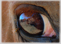
| 08/25/2008 01:51:00 AM |
|
| Photographer found comment helpful. |
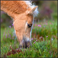
| 08/25/2008 01:50:22 AM |
Summer Foalby JedusiComment: Perfect color, not overly saturated as some would have the tendency to do. Focus on the foreground and head are perfectly balanced with the bokeh in the rear. |
| Photographer found comment helpful. |
| 08/25/2008 01:48:29 AM |
|
| Photographer found comment helpful. |
| 08/25/2008 01:47:29 AM |
New Shoesby dainmcgowanComment: Too bad you couldn't have made the horse look towards the camera. Lighting seems a little underexposed. |
| Photographer found comment helpful. |
| 08/25/2008 01:44:14 AM |
|
| Photographer found comment helpful. |
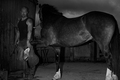
| 08/25/2008 01:43:12 AM |
Canterby docurrieComment: Normally I could care less about that 2/3's rule(a good shot is a good shot in my book), but having the rider high and centered in the frame makes me look at her and not the horse. |
Home -
Challenges -
Community -
League -
Photos -
Cameras -
Lenses -
Learn -
Help -
Terms of Use -
Privacy -
Top ^
DPChallenge, and website content and design, Copyright © 2001-2025 Challenging Technologies, LLC.
All digital photo copyrights belong to the photographers and may not be used without permission.
Current Server Time: 08/28/2025 12:28:26 PM EDT.