| Image |
Comment |
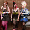
| 08/17/2007 12:16:01 AM |
Punk Girlsby sunraygpComment: I like the various colors in this picture. Maybe if you had positioned the girls in an area away from the grate it may have had a little more oomph overall. |
 Photographer found comment helpful. Photographer found comment helpful. |
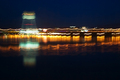
| 08/17/2007 12:13:11 AM |
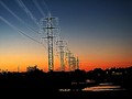
The River Crossing By Train.by docpjvComment: I am not sure if the movement of the camera was intentional for this picture. IMHO I think it takes away from the picture. The colors and what I believe to be reflection could have been very nice without the distortion. |
| Photographer found comment helpful. |
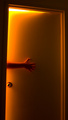
| 08/17/2007 12:11:15 AM |
At Hell's Entranceby SomeamateurComment: Creepy picture in a good way. The bright light at the top of the door is distracting and pulls the eye away from the hand. |
| Photographer found comment helpful. |
| 08/16/2007 01:12:17 PM |
Portrait of a Jumperby darnokComment: I like how this jumper almost seems to have long eyelashes. The picture does seem to be a bit over sharpened and blown out in areas. I think a little more cropping from the right, some noise reduction and enhancing the colors a bit could have added to this picture. As far as what I think are blown out spots, I could be wrong; those can't really be corrected using Photoshop. Those have to be corrected during shooting. |
| Photographer found comment helpful. |
| 08/16/2007 01:07:26 PM |
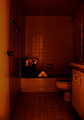
Phobiaby zaflaboutComment: I am unsure of what exactly your picture is trying to get across. I know the title is phobia but, of what. I also think reducing the reddish orange coloring and cropping out some more of the door and counter could have improved the image a bit. |
| Photographer found comment helpful. |
| 08/16/2007 01:04:03 PM |
DarkSideby f0rTyLeGzComment: I like the abstractness and the colors go well together. Maybe a little more cropping at the top would have helped as I think the clouds (at least I think it is clouds) take away from the overall picture a bit. |
| 08/16/2007 01:00:46 PM |
Wiredby silverhawkComment: I like the composition of this picture. I think this picture could have really been awesome with some noise reduction. The colors in the sky really add to this! |
| Photographer found comment helpful. |
| 08/16/2007 12:59:04 PM |
My Dogby eaglebeckComment: What a precious little pooch. Your picture could be enhanced with a clearer focus, some noise reduction and then enhancing the colors a bit. You can do a world of wonders when using some of what Photoshop offers. |
| 08/16/2007 12:54:09 PM |
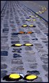
Fried Eggsby ephlnComment: The idea you were going for is very unique. I believe that the black area surrounding the yolks really detracts from the eggs and the overall picture. |
| Photographer found comment helpful. |
| 08/16/2007 12:51:16 PM |
Glen Onoko #77by mhComment: I think this picture has potential with a little more cropping at the top to take out the over powering light in the upper left corner. You might also try removing the red spot in the lower right corner, sharpening and boosting the colors a bit. I like the overall composition. |
| Photographer found comment helpful. |
Home -
Challenges -
Community -
League -
Photos -
Cameras -
Lenses -
Learn -
Help -
Terms of Use -
Privacy -
Top ^
DPChallenge, and website content and design, Copyright © 2001-2025 Challenging Technologies, LLC.
All digital photo copyrights belong to the photographers and may not be used without permission.
Current Server Time: 08/02/2025 03:11:26 AM EDT.