| Image |
Comment |
| 12/20/2007 01:31:07 PM |
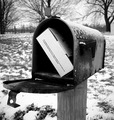
Finally!by libertyComment: One of the best concepts, great B&W tones although the ground in the bottom right hand corner looks a bit out of place as it has much higher contrast than anywhere else |
 Photographer found comment helpful. Photographer found comment helpful. |
| 12/20/2007 01:24:29 PM |
"Soon the Hunt Will Begin..."by RoosterComment: Interesting lighting and works well because of the black backdrop - any small distracting background elements would have ruined this. If only the figure was position more to the left |
| Photographer found comment helpful. |
| 12/20/2007 01:04:58 PM |
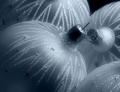
Vintage Ornaments by KarenNfldComment: Great lighting and lovely tones. Very festive too and so this should be popular. Interesting choice of duotone hue, Christmas not often associated with cold colours, more the traditional warm golden / red tones of a roaring fireplace or something - however it works so well here. Well composed and not spoilt by any complicated distracting background elements. |
| Photographer found comment helpful. |
| 12/20/2007 01:01:20 PM |
he Bought mE on eBay!by LonzComment: Not a fan of the lighting and you have ended up with burnt out highlights and shadows; there is perhaps even a bit of chromatic aberration creeping which isn't ideal. Well composed and the crop rotation adds interest |
| Photographer found comment helpful. |
| 12/20/2007 12:58:50 PM |
|
| Photographer found comment helpful. |
| 12/20/2007 12:56:15 PM |
Spa Duckyby signal2noiseComment: Quite a simple shot well executed but probably has too low a difficulty factor to score highly. Good sharpness on the head of the duck but the surface itself is quite busy and so you almost have two unrelated subjects. Perhaps a simple, neutral environment in which the place the brightly coloured duck would work better for me |
| Photographer found comment helpful. |
| 12/20/2007 12:52:40 PM |
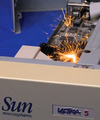
negitive feedback !!! Will not buy from seller again!! by ralphComment: The composition seems a little awkward somehow, the text is very near to the bottom, you can see a very small amount of text just to the left of the "S" in Sun which could have been cropped out. I think that perhaps a simple macro of the sparks and motherboard without the case, text and blue surface in shot would have been a lot cleaner. The same simplification process could also be applied to the title, just "Negative Feedback" would have been spot on. |
| 12/20/2007 12:47:52 PM |
"faulty" 250gb HDD from eBayby GueDesignsComment: Lovely macro and golden tones. So many choices of where to place the focal point, I imagined you might have tried the tip of the arm but perhaps you went for this one instead because that might have ment only a very small area of the image was in focus so you did the right thing doing what you did. The image seems a little noisy though, perhaps its just my dislay but I would have thought you would have used a tripod and the lowest ISO possible and gotten perfect quality |
| Photographer found comment helpful. |
| 12/20/2007 09:00:01 AM |
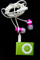
GREEN Pod!by DCPhotoComment: I'm guessing you have done this arrangement to make the subject look like something but your title is not really helping me. Looks like it could be in the shape of a flower perhaps? A rotation ccw to square up the main body would have made this work better IMO |
| 12/20/2007 08:57:23 AM |
Bulk Order of M&M'sby JudiComment: Seen something very similar in the popcorn challenge and so unfortunately for me, this have lost some of its impact. Good colours though, sharp eyes and well composed and given your title it fits quite nicely and is nice not to have to vote on a still life |
| Photographer found comment helpful. |
Home -
Challenges -
Community -
League -
Photos -
Cameras -
Lenses -
Learn -
Help -
Terms of Use -
Privacy -
Top ^
DPChallenge, and website content and design, Copyright © 2001-2025 Challenging Technologies, LLC.
All digital photo copyrights belong to the photographers and may not be used without permission.
Current Server Time: 08/24/2025 04:49:51 PM EDT.