| Image |
Comment |
| 02/11/2003 08:33:55 PM |
tumbling dominoesby MajorChaosComment: nice macro.. good colors against the black. nice perspective.. but a whole lot going on. a bit too busy for me. |
 Photographer found comment helpful. Photographer found comment helpful. |
| 02/11/2003 08:32:12 PM |
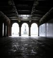
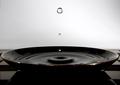
Cloisters.by catpixelComment: this must have been a tough exposure, since you are in a dark area and shooting into light. hmmm. I unfortunately don't have a suggestion on what to do about it. the idea is neat. I would have liked to see more detail in the fountain at the end, and the image itself is tilted. |
| Photographer found comment helpful. |
| 02/11/2003 08:03:27 PM |
Liberty and Justice for All - 2by kevinswopeComment: is that the moon on the lower right?
nice perspective. focus on the flag (subject) where it should be with the pole in short dof to keep the attention off of it.
nice. |
| Photographer found comment helpful. |
| 02/11/2003 08:02:19 PM |
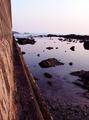
THE WALLby AntithesisComment: nice leading lines, and view of the distance. the horizon is sloped a bit too much to the right. slightly over exposed.. good overall. |
| Photographer found comment helpful. |
| 02/11/2003 07:58:17 PM |
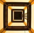
Don't Look Up!by JakComment: eek! I feel like I am looking down! Either way good perspective.. the leading lines in brass/yellow are in nice contrast to the darker tones. The lighting must have been poor.... I can see some loss of quality in the darker areas. |
| 02/11/2003 07:53:53 PM |
Columbiaby tfarrell23Comment: Lighting on this image is a bit bright causing the star to appear out of focus. Nice idea, but does not shout "perspective" at me. |
| Photographer found comment helpful. |
| 02/11/2003 07:42:35 PM |
Triangles?by jab119Comment: nice perspective. lots of great patterns. a bit dark, and appears maybe oversharpened. |
| Photographer found comment helpful. |
| 02/11/2003 07:38:57 PM |
Barren Heightsby CreativeFlyPhotoComment: excellent texture detail. sky is washed out, but I think it works here, and adds to the harshness and contrast of the photo.. the weathered look came from a harsh world. The composition is good and meets the challenge. |
| 02/10/2003 12:14:31 PM |
Roast, Grind, Brew and Enjoy!by DougPazComment: Critique Club Assignment:
Composition: Alot of elements. Alot to look at... too much possibly. For instance.. A coffee cup with the progression of the beans to the ground coffee I think would have been more than enough. The angle is a bit skewed, and might even be more effective from lower down perspective with the display of beans and grounds fanned out a bit more with the coffee cup at a point in the back of that. Now I have made a different photo haven't I? LOL . Sorry. :P
Technical: Could be sharper initially. It appears it was over sharpened in post processing. The lighting is not very appealing. It is causing harsh shadows, and glints on the metal.
Overall: It tells a story which is confusing to sort out at first. I think the idea was great though. |
| 02/10/2003 12:16:09 AM |
|
Home -
Challenges -
Community -
League -
Photos -
Cameras -
Lenses -
Learn -
Help -
Terms of Use -
Privacy -
Top ^
DPChallenge, and website content and design, Copyright © 2001-2025 Challenging Technologies, LLC.
All digital photo copyrights belong to the photographers and may not be used without permission.
Current Server Time: 08/17/2025 01:33:16 PM EDT.