| Image |
Comment |
| 11/08/2004 12:29:26 AM |
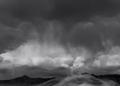
Storm over the desertby MrAkamaiComment: Thank you to all who left comments for me. As for my choice of b/w vs color, it was fairly easy for me since I really love b/w and I am trying to get back in touch with my photographic roots. While I did debate whether or not to enter b/w or color, the debate did not last long. I will post a color version of this photo later for those that said a color version would have been better.
As for those that voted me a 1, 2 or 3 (and maybe 4), why did you think it was so bad? Did you leave comments for me? If so, please PM me so I can figure out what I did that deserved that score from you. I am not angry but I just want to know what I did that deserved that low score.
Thank you!
PS: Here is the color version although not in it's ideal form and still needs some editing but enough to give you an idea of what it looks like in color.
 Message edited by author 2004-11-08 00:38:00. Message edited by author 2004-11-08 00:38:00. |
| 11/03/2004 10:09:16 AM |
Shapesby GabrielComment: The top of the pyramid is not lined up. Nice shot of the Louvre, though. |
 Photographer found comment helpful. Photographer found comment helpful. |
| 11/03/2004 10:06:55 AM |
Rockyby scrum8Comment: The tree branches are distracting. |
| Photographer found comment helpful. |
| 11/03/2004 10:04:51 AM |
Canadaby labudsComment: Why are the maple leafs on the left and right blurry? Did you want the viwer to pay more attention to the center leaf? I think it would have been better if all of the leaves were in focus. |
| 11/03/2004 10:00:46 AM |
|
| 11/03/2004 09:55:32 AM |
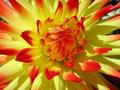
Dahliaby njtaylorComment: Nice photo but can you make it a bit larger next time? Max pixel dimension is 640 pixels. |
| Photographer found comment helpful. |
| 11/03/2004 09:44:29 AM |
Roscoe P Coltraneby kdkaboomComment: LOL! I just had to say that name out loud! That brought back some good memories of them Dukes! Great macro of your cat. Just that I find it odd that the focal point is the nose, however, and no leading lines to the rest of the face. |
| Photographer found comment helpful. |
| 11/01/2004 02:48:03 PM |
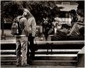
Amoreby PedroComment: Great candid shot but the man in the background is slightly distracting. Although it is probably level, the stairs make it seem otherwise. Nice duotone, as well. |
| Photographer found comment helpful. |
| 11/01/2004 02:46:42 PM |
Lighthouseby Keith ManiacComment: Very simple composition but effective with its message. I think it would have looked better if you applied the rule of thirds horizontally as the breakwater seems quite long. |
| Photographer found comment helpful. |
| 11/01/2004 02:44:16 PM |
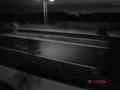
lonelyby Pictar500Comment: Very blurry and difficult to make out what's in the photo as a result. The date and time stamp in the lower right corner is distracting. |
| Photographer found comment helpful. |
Home -
Challenges -
Community -
League -
Photos -
Cameras -
Lenses -
Learn -
Help -
Terms of Use -
Privacy -
Top ^
DPChallenge, and website content and design, Copyright © 2001-2025 Challenging Technologies, LLC.
All digital photo copyrights belong to the photographers and may not be used without permission.
Current Server Time: 08/20/2025 01:54:13 AM EDT.