| Image |
Comment |
| 01/26/2004 02:40:00 AM |
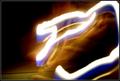
Painting With Lightby CatherineComment: Excellent interpretation of the challenge! Personally, with such a stark contrast between the black background and the border, I would have used a thinner frame instead to keep focus on the subject vs the frame. That is a minor fault but I still find this an excellent entry. I'm even willing to ignore the minor compression problem in the middle of the "paint stroke" 10! |
 Photographer found comment helpful. Photographer found comment helpful. |
| 01/26/2004 02:36:04 AM |
Fire, light the way.by moviemanComment: Well exposed with good contrast. Very low noise considering the light levels. I'm not sure what pattern the light is intended to create other than to illuminate the subject's face. The only problem I have with the light pattern is it is a little jittery.I think this type of shot would benefit from a smoother movement of the light source. |
| Photographer found comment helpful. |
| 01/26/2004 01:26:20 AM |
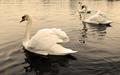
Three Swansby ImagineerComment: This is my favorite of the three images you have of the swans. The perspective and cropping you did are top notch. Excellent detail, composure and focus. The only thing I might change is the color balance as I see a bit too much red/magenta in there. That may be the real color due to the sky but otherwise, great shot! |
| Photographer found comment helpful. |
| 01/26/2004 01:22:47 AM |
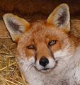
Fred the Foxby ImagineerComment: Great details of the fur! I can see every single strand. Although I would expect a shadow from the flash, it's almost non-existant which is amazing. Great job! |
| Photographer found comment helpful. |
| 01/26/2004 01:16:42 AM |
|
| 01/24/2004 01:47:11 PM |
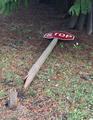
Don't Stopby cabaComment: Great idea for the challenge! This entry needs to be cropped a little off the top and to the right of the sign. The ground seems a bit bright. Good focus and detail, however. |
| Photographer found comment helpful. |
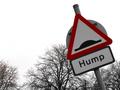
| 01/24/2004 01:45:39 PM |
|
| Photographer found comment helpful. |
| 01/24/2004 01:44:41 PM |
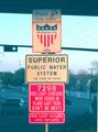
welsh duplicateby xburnerxComment: Great overall image! I like the clouds and the sky. The sign is interesting however it looks a bit under exposed. Not sure if it was possible but maybe crop the bottom a bit closer to eliminate the annoying street lights and maybe the hill. |
| Photographer found comment helpful. |
| 01/24/2004 01:42:07 PM |
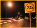
Speedingby helgiComment: Great composition and lighting. Blurred car lights is also excellent. I have one complaint and that's with the lens flare around the street light. It looks like there was a small drop of water which cause the extra flare on the immediate left of the light. Other than that, excellent job! 9. |
| 01/24/2004 01:38:57 PM |
|
Home -
Challenges -
Community -
League -
Photos -
Cameras -
Lenses -
Learn -
Help -
Terms of Use -
Privacy -
Top ^
DPChallenge, and website content and design, Copyright © 2001-2025 Challenging Technologies, LLC.
All digital photo copyrights belong to the photographers and may not be used without permission.
Current Server Time: 08/23/2025 03:53:14 PM EDT.