| Image |
Comment |
| 02/09/2004 01:20:30 AM |
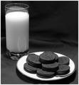
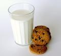
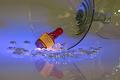
Cookies-n-milkby MrAkamaiComment: Originally posted by tarique:
next time try hanging a few long white paper strips in front of the glass but out of the frame for a better effect. |
Would that just serve to reflect more light onto the subject? I'm building a small wood frame to take product pictures at work and it will have open sides for lighting. I plan to drape white sheets on the sides and top to diffuse light. That setup should eliminate the harsh shadows like the ones found in this picture. |
| 02/04/2004 01:38:30 AM |
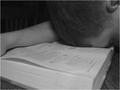
College and Exhaustionby jrs915Comment: I can totally relate to that. Many a time did I fall asleep while reading books despite many cans of Mountain Dew. This entry seems a bit flat in the contrast department. If the levels were adjusted, I'm sure this would fare better. |
 Photographer found comment helpful. Photographer found comment helpful. |
| 02/04/2004 01:35:54 AM |
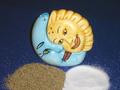
"Salt and Pepper" Shakers!by tolovemoonComment: I hate to be the bearer of only negative comments, sorry. Lighting seems to be a bit harsh and this is not the most exciting composition. |
| 02/04/2004 01:34:33 AM |
Toothbrush & Toothpasteby EddyGComment: LOL! This made me laugh. Such a good idea. Looks like a commercial for Aqua Fresh. Great setup and spotlight. A+! I give it a 10. |
| Photographer found comment helpful. |
| 02/04/2004 01:33:26 AM |
|
| Photographer found comment helpful. |
| 02/04/2004 01:31:54 AM |
What a team!!by PepetteComment: Great detail on the cookies but the lighting on the left side of the glass is a bit bright and harsh. |
| Photographer found comment helpful. |
| 02/04/2004 01:29:10 AM |
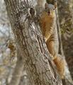
Squirrels and Treesby CamComment: Very cute! I wish I could get a picture of squirrels but they move quickly and hate to stay put for long. |
| Photographer found comment helpful. |
| 02/04/2004 01:26:57 AM |
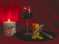
Dubliner Cheese with Cabernet Sauvignonby kayceeComment: Nice composition but this entry is plagued by lots of compression. Image is quite grainy. This is caused by high ISO settings or too much compression to fit file size in your photo-editing application. Most likely the first reason. |
| Photographer found comment helpful. |
| 02/04/2004 01:23:39 AM |
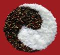
Salt and Pepperby sfaliceComment: Very creative! Cropping seems to be fairly even just by eyeballing it. Colors of the pepper look nice and clean. Salt crystals are white and detailed. The only thing I can complain about is the entire edge of the yin yang design. It appears that this was selected off a different background (obvious, I know) but the part I'm talking about is the sharp edge between the salt and pepper and it's very "edgy". If you applied a light feather to that and then slapped it on the background, it might look more natural and less edgy. Overall, an excellent entry. 8. |
| Photographer found comment helpful. |
| 02/04/2004 01:13:11 AM |
Whisky and a Glass (of any kind)by deckyonComment: AMAZING! I love how you can see only half of the glass. The glass beads/stones are a nice touch. I also like the spotlight by the Maker's Mark bottle. Very clean and extremely detailed. But that last bit is also your downfall. There's too much detail in the glass as I can see some background reflected in it. If that was not there, I'd rate this a 10. I wish there were half points cause then I'd give you 9.5 but I cannot so you get a 9. Great job! |
| Photographer found comment helpful. |
Home -
Challenges -
Community -
League -
Photos -
Cameras -
Lenses -
Learn -
Help -
Terms of Use -
Privacy -
Top ^
DPChallenge, and website content and design, Copyright © 2001-2025 Challenging Technologies, LLC.
All digital photo copyrights belong to the photographers and may not be used without permission.
Current Server Time: 08/23/2025 11:27:09 AM EDT.